What We Did:
- Logo Design
- Colors and Fonts
- Style Guide
The Challenge:
qb faced a big challenge when they decided to change their focus from just selling clothes to becoming a creative platform. The founder needed a new look for the brand that showed this shift and wanted a consistent style for their online presence. The challenge was to make sure the brand’s new visual identity matched its updated mission and could make a strong impression online.
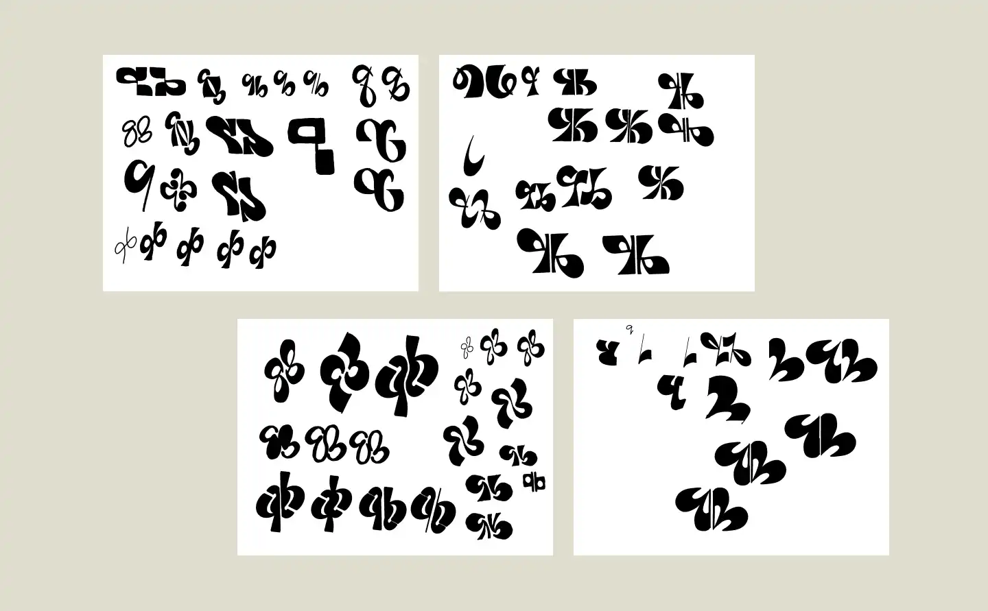

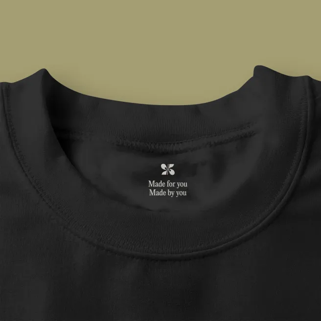
Playful Luxury
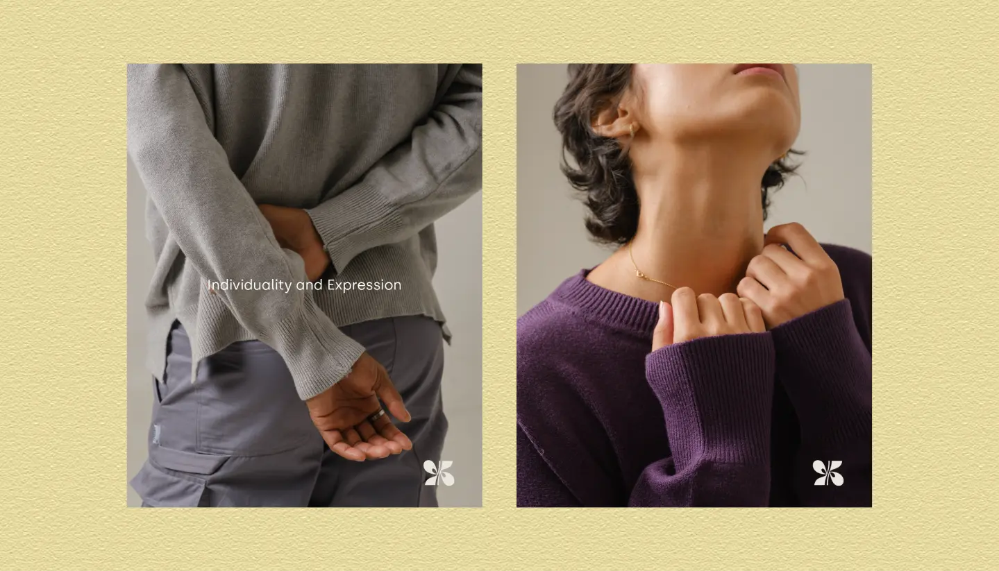
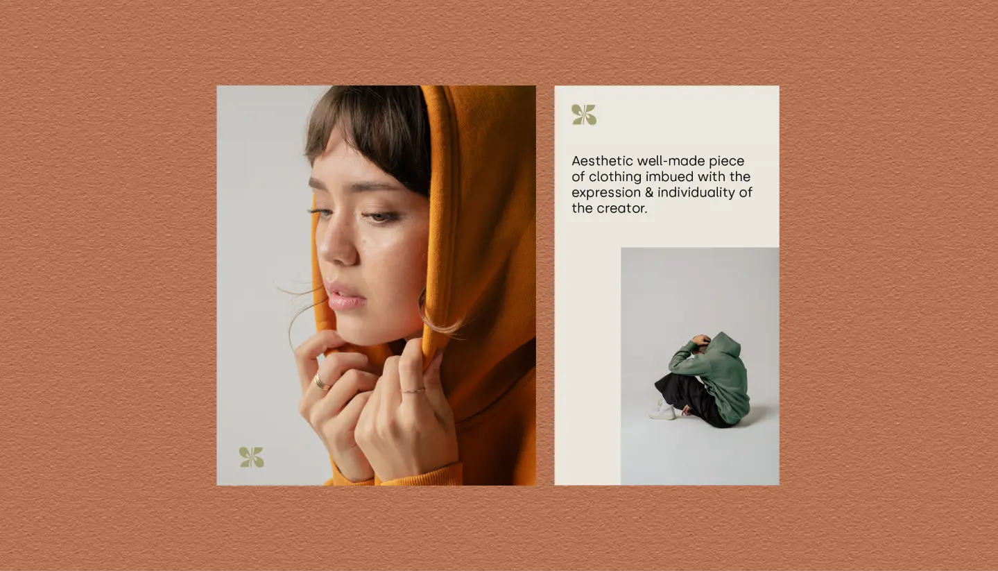
The visual identity threads between playfulness and luxuriousness — a brand that’s seemingly exclusive but surprisingly accessible.
These two keywords inspired the creation of the logo and the choice of colors and typography.
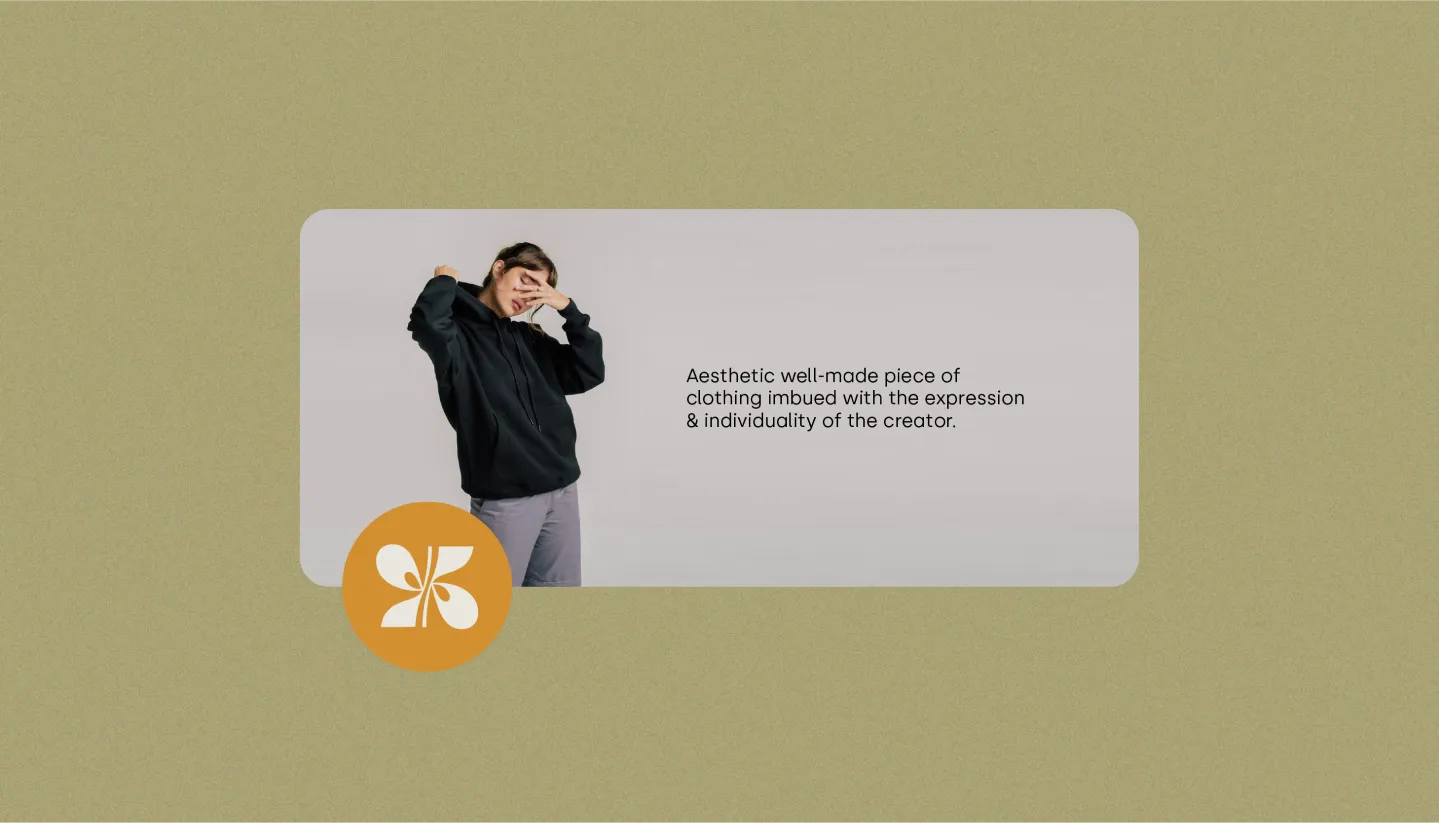
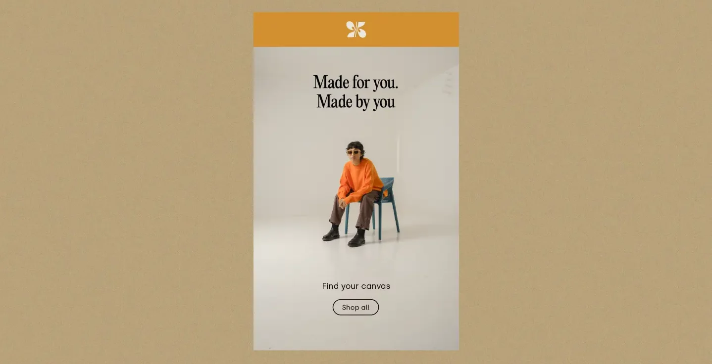
The brand’s color palette was meant to communicate a balance between accessibility and luxury. For the main colors, we chose a muted orange and green scheme.
The secondary colors are to be used as background colors. We made sure to propose colors that allows the main colors to pop even more.

