")
Online Coffee Shop
Brewing Culture and Craft Into Every Cup
- Logo
- Colors & Fonts
- Key Visuals
- Collaterals Design
- Packaging Design
- Style Guide
- Logo
- Colors & Fonts
- Key Visuals
- Collaterals Design
- Packaging Design
- Style Guide

The Taal Roast is a family-owned coffee brand dedicated to increasing appreciation for locally grown and roasted coffee beans. With deep ties to Filipino heritage, the brand’s mission is to showcase the richness of local coffee while reflecting the warmth and vibrancy of Filipino culture.
The Challenge
In a competitive industry crowded with both local and international coffee brands, The Taal Roast sought to stand out with the help of visual branding. However, there was an additional layer of complexity—conflicting design preferences among the founders. They needed a brand that blended elegance with the playful, festive Filipino personality.


Creative Direction
A Balancing Act
By combining elegance and festivity, The Taal Roast doesn’t just look good—it feels unique. It’s a brand that stands out for being professional yet warm, premium but never intimidating. Whether someone’s grabbing a bag of beans for their morning brew or gifting it to a coffee-loving friend, they’ll feel the perfect mix of quality and Filipino charm.

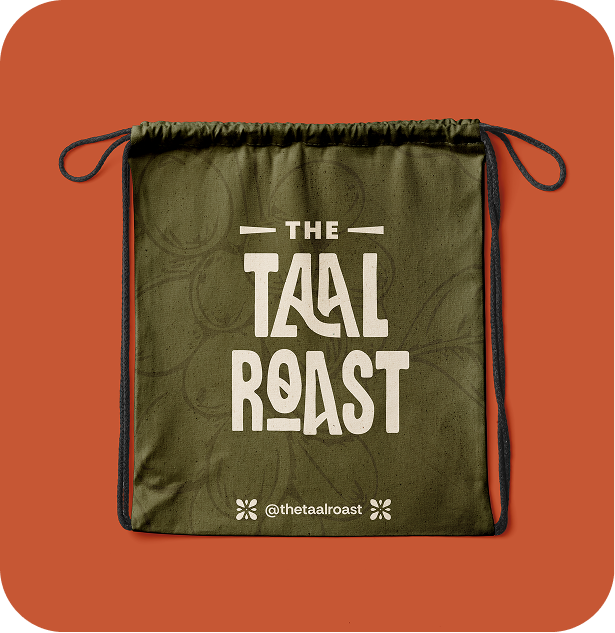
The Logo
A Nod to Taal
The logo is where it all begins. For The Taal Roast, we created a custom wordmark that’s full of subtle details:
- Volcano-Inspired A’s: A clever nod to the iconic Taal Volcano, tying the logo back to the brand’s name and heritage.
- Coffee Bean O: The “o” in the logo is shaped like a coffee bean, keeping the focus on their product.
We gave it a slightly hand-drawn feel to add a personal, artisanal vibe—perfect for a family-owned business.

Colors & Fonts
Warm, Rich, and Balanced
The Taal Roast’s colors and fonts strike the perfect balance between classy and fun. The warm palette—think deep browns, earthy reds, and golden yellows—feels cozy and inviting while still looking polished. For fonts, we paired Citrus Gothic Bold (with its cool, textured vibe) with Rethink Sans, a clean and friendly font that keeps everything easy to read. Together, they make the brand feel premium but still approachable.
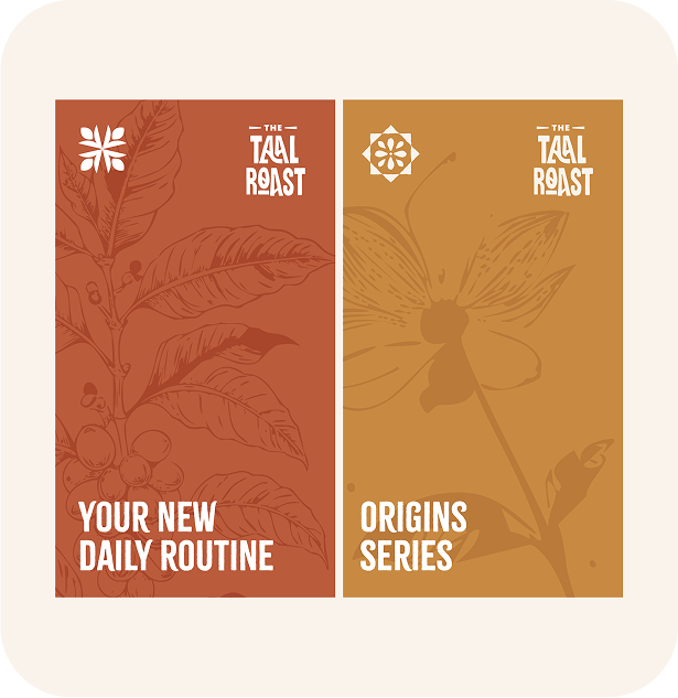


Key Visuals
Celebrating Filipino Culture
The Taal Roast’s visuals are rooted in Filipino heritage, bringing culture into every design element:
Primary Illustrations and Patterns:
- Inspired by Filipino symbols like the sun, palm trees, and traditional textiles.
- Hand-drawn textures keep the visuals playful and authentic.
Secondary Illustrations:
We created monochromatic drawings of coffee beans, plants, and local landscapes. This adds a quiet elegance and avoids looking too similar to other coffee brands.
Together, these visuals make the brand stand out while paying homage to its roots.


Packaging
Celebrating Filipino Culture
The packaging design tells a visual story of The Taal Roast’s origins:
- Custom Landscape Illustration: Coffee beans in the foreground, Taal Lake in the background—it’s a perfect blend of product and place.
- Practical Details: Sticker templates allow for easy customization, showcasing important info like bean type, flavor notes, and roast date.
This design is not just eye-catching—it’s functional and memorable.

The Outcome
See More

Truly Pasig: A modern legacy for the city and its people.
Pasig City Hall Construction Consortium • Government

Weaving a Shield of Defense for Advocacy and Justice
La Viña Zarate • Law Firm