")
Government
Truly Pasig: A modern legacy for the city and its people.
- Logo
- Colors & Fonts
- Key Visuals
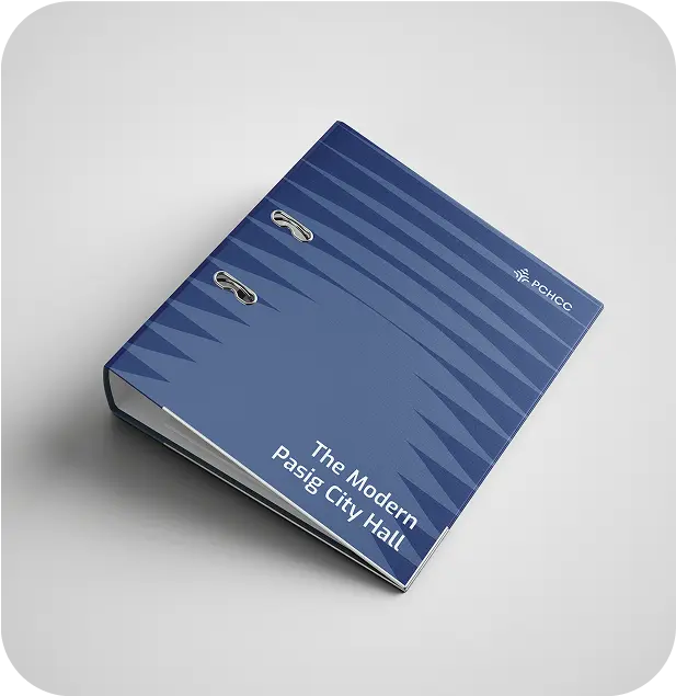
- Collateral Design
- Style Guide
- Logo
- Colors & Fonts
- Key Visuals
- Collaterals Design
- Packaging Design
- Style Guide

In 2024, the Pasig City Hall Construction Consortium was created in order to modernize the Pasig City Hall and bring a better user experience to its people.
The Challenge
With this project, the consortium in charge of rebuilding the city hall wanted to leave its legacy. They wanted a modern and clean visual identity that communicated the project’s philosophy, and differentiated itself from the typical and poor government designs.
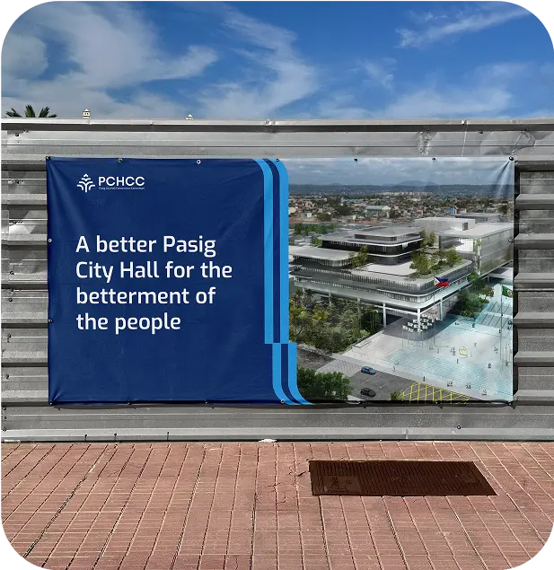
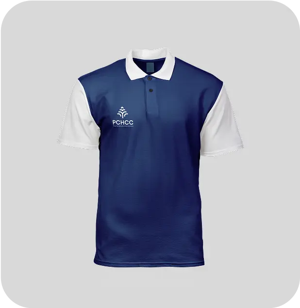
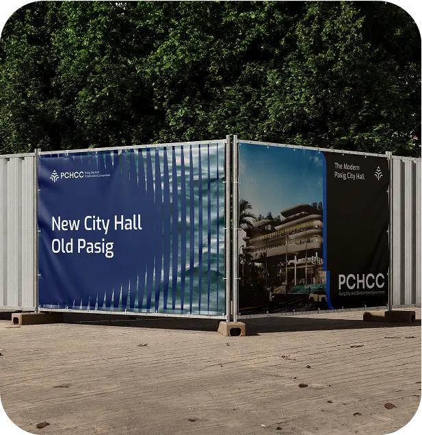
They needed a flexible visual identity that could be applied in different use cases, such as presentation decks, signages, uniforms, etc.


Creative Direction
Truly Pasig
The goal of the Joint Venture’s project is to preserve Pasig City’s Cultural Identity and give the land back to the people. This too needed to be communicated in its visual identity.
There are 3 things that represent this project:
- The Revolving Tower of Pasig (its landmark)
- The Pasig River (its trademark)
- The Pearlized Philosophy (the architectural philosophy of the new City Hall

The Logo
A Symbol of Progress
We explored 3 concepts that communicated the ideas set in the creative direction.
Out of all the designs presented, this logo stood out for the following reasons:
- It had a subtle incorporation of the revolving tower,
- Its soft edges resembled the architecture of the new city hall
- Its repeating lines were inspired by the rough texture of an oyster (referencing the project’s pearlized design philosophy)

Visual Identity
A Unified Identity System
Inspired by the city hall’s architectural philosophy, we created a clean typeface with rounded edges to balance sophistication and approachability. The color palette, aligned with the Joint Venture’s branding, reinforces Pasig’s identity. Key Visuals, drawn from the ripples of the Pasig River, add depth and versatility as textures or frames, capturing the city’s vibrancy.

The Outcome
- A modern and clean visual identity that is distinct from the typical “government project” look
- A flexible visual identity that they can easily apply for external communications of the brand
- An extensive style guide for consistent use of all brand assets, ensuring a professional image to the public
See More

Mentoring brylliance and leaving a legacy
Brylle Barriga • Personal Brand

Brewing Culture and Craft Into Every Cup
The Taal Roast • Online Coffee Shop