")
Healthy Baked Goods
Healthy Goodies You’d Actually Want to Eat
- Brand Strategy
- Brand Naming
- Logo Design
- Colors & Fonts
- Key Visuals
- Packaging Design
- Brand Book
- Brand Strategy
- Brand Naming
- Logo Design
- Colors & Fonts
- Key Visuals
- Packaging Design
- Brand Book

Healthy food that actually tastes good? Yes, it exists.
Cravoree is here to prove that you don’t have to choose between what’s good for you and what tastes amazing. With gut-friendly ingredients, fully transparent labeling, and flavors that hit the spot, they make healthy eating easy—and actually enjoyable.
Because let’s be real: most “healthy” treats either taste like cardboard, aren’t really healthy, or are impossible to find. Cravoree changes that by giving you baked goodies that are good for your body and your taste buds.
The Challenge
Before Cravoree became Cravoree, they were stuck with a few big problems:
- No brand name—They had no clue what to call themselves.
- No brand strategy—They wanted to market their products but had no idea how to communicate their brand.
- No clear differentiation—They didn’t want to look like just another “boring healthy brand” but weren’t sure how to stand out.
Basically, they had an amazing product but no way to properly present it to the world.


Brand Strategy
Nailing the Big Idea
We started by figuring out what Cravoree truly stood for.
- Big Idea: Good food = good for both your gut and taste buds.
- Promise: We make the healthy choice the easy choice.
- Messaging Pillars: Transparent labeling, deliciously healthy, healthy eating as a lifestyle, and accessibility.
This gave them a strong foundation—something they could confidently stand behind in their marketing.

Brand Naming
Naming That Hits the Sweet Spot
We needed a name that captured everything they stood for: fun, flavor, and a love for food.
Enter Cravoree—a playful twist on the word “crave.” It reflects the brand’s mission to make healthy food something you actually look forward to eating. Plus, it’s catchy, fun to say, and easy to remember.

Logo Design
Kindness at a Glance
We designed a clean, connected wordmark that reflects Cravoree’s personality:
- Soft curves for warmth and approachability.
- Flowing connections to symbolize ease and accessibility.
- Subtle movement for a joyful, indulgent feel.
The icon is a simple yet meaningful touch—an inverted “C” with a heart in the negative space. It symbolizes Cravoree’s kind and caring approach to health, reinforcing their commitment to making healthy eating feel good in every way.
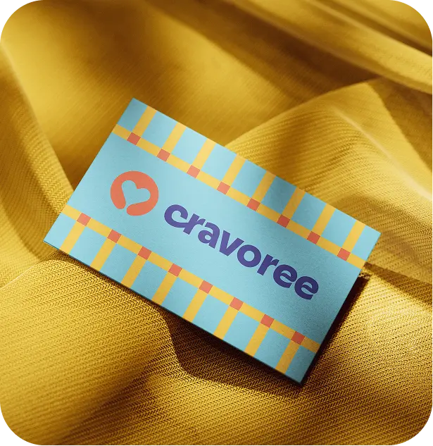


Visual Identity
Feels as Good as It Tastes
Cravoree’s colors, fonts, and key visuals work together to create a fresh, inviting, and trustworthy feel. Sky blue conveys freshness and transparency, golden yellow and soft green bring warmth and health, while warm orange adds energy and familiarity. Creamy beige keeps it all grounded with simplicity.
For typography, Passion One adds bold personality to headlines, reminiscent of homemade treats, while DM Sans keeps body text clean and easy to read.
To further bring the brand to life, we designed a signature pattern inspired by classic tablecloths—a nostalgic nod to warm, homey gatherings and the joy of sharing good food. This familiar, welcoming design reinforces Cravoree’s promise to make healthy eating effortless and enjoyable.


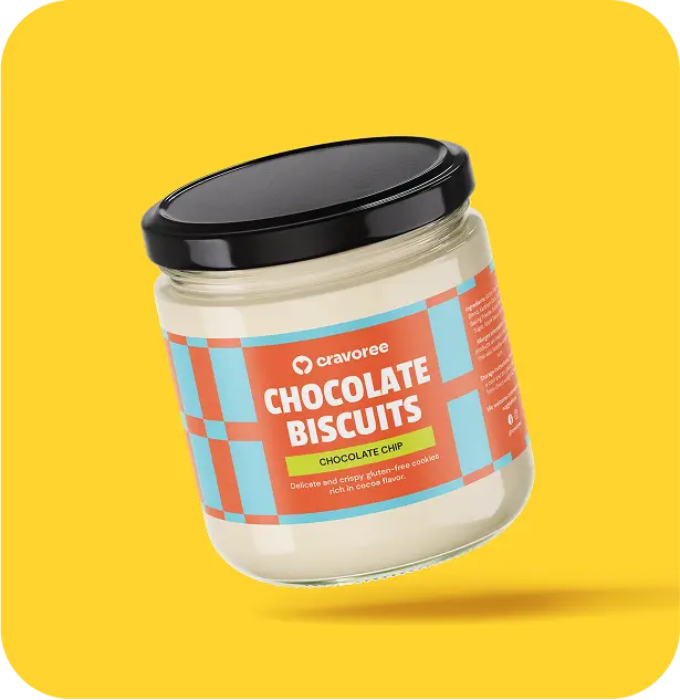
Packaging
Healthy Eating Wrapped In Joy
To ensure Cravoree’s products look as good as they taste, we designed:
- Jar Labels that are sleek, inviting, and modern.
- Pouch Stickers with a flexible template for a consistent look.
- Box Designs that stand out with vibrant colors and fresh aesthetics.
Instead of blending in with the typical clean, minimalistic health brands, Cravoree leans into bright colors and playful imagery, making their packaging instantly recognizable.


The Outcome
With a strong name, clear messaging, and a vibrant visual identity, Cravoree is now more than just a healthy baked goods store—it’s a brand that makes healthy eating easy, enjoyable, and something to look forward to.
See More

Weaving a Shield of Defense for Advocacy and Justice.
La Viña Zarate • Law Firm

The bookkeeper turning chaos into confidence.
Katherine Chua • Bookkeeper