Pat Matti is a certified business and career coach offering comprehensive one-on-one career and leadership coaching for anyone who wants to break free from their current financial struggles and achieve a more fruitful and empowered life.
The Challenge:
To get more clients, Pat wanted to start focusing on her marketing. Before she could start marketing her services, she knew she needed to work on her brand first —identifying who she is and what she can offer. She knew what she wanted to say to her audience but she couldn’t articulate it.
What We Did:
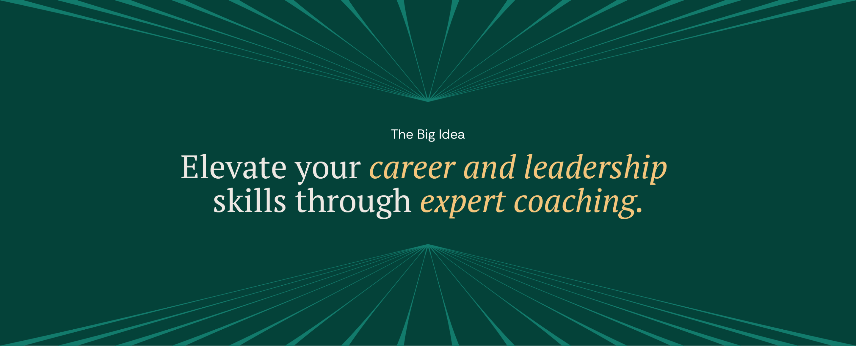
- The Big Idea
- Brand Difference
- Tagline
- Messaging
- Content Pillars
- Visual Identity
- Brand Guide

Brand Strategy
Getting to the heard of the brand
Personal branding is a delicate matter as the brand needs to remain authentic to the person. When creating Pat’s strategy, we needed to make sure we could capture the essence of her brand. Through a 90-minute strategy session, we took a deep dive in her brand’s story, clients, vision.
What we covered:
- Big Idea
- What Makes Her Different
- Audience
- Offer Benefits
- Reason(s) to believe
Messaging
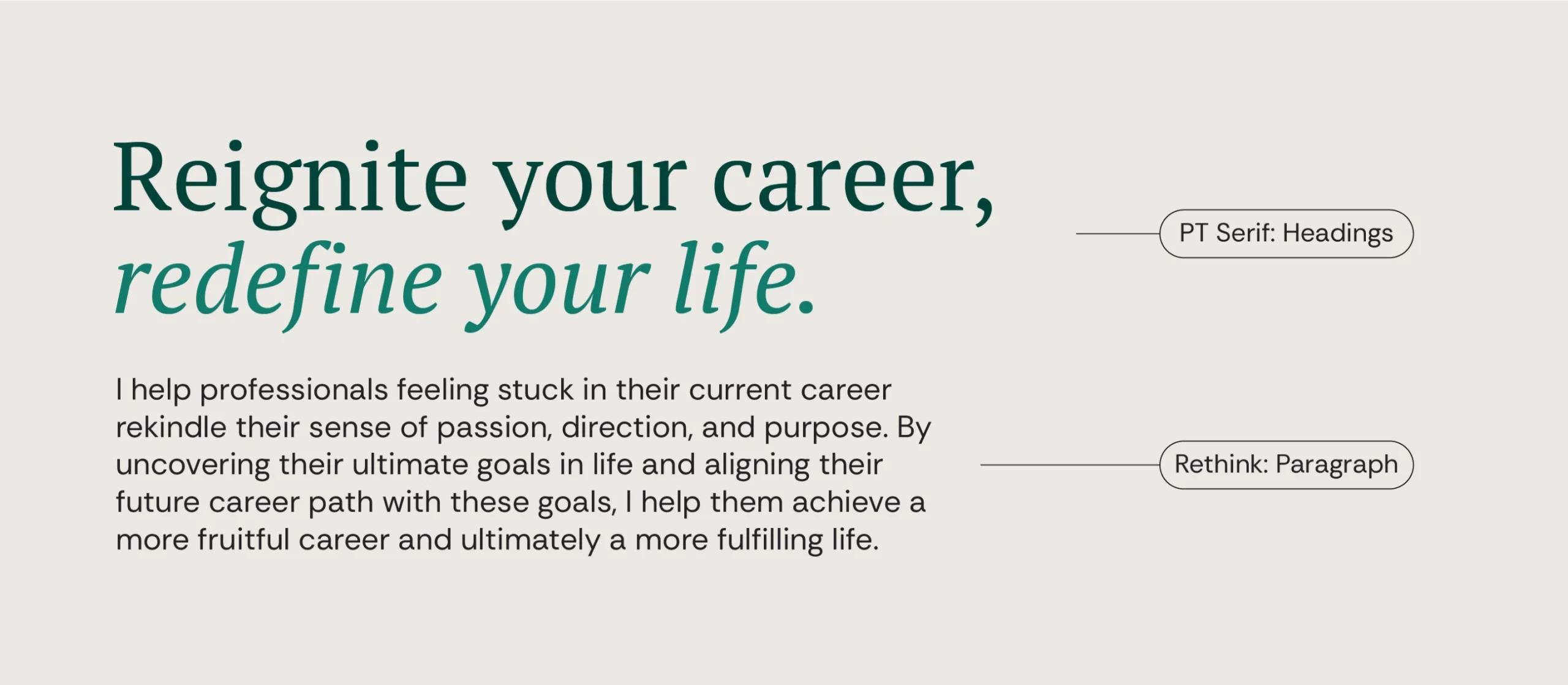
Reignite your career, redefine your life
For Pat to kickstart her marketing, she needs to be able to communicate who she is, what she does, and why she matters to her audience. To do that, we developed 4 messaging pillars that served as a basis for all of her content. We also created guidelines on HOW these messages would be communicated
What we covered:
- Tagline
- Personality
- Voice and Style
- Tone of Voice
- Message House

Visual Identity
Pat’s personality is similar to the season of Autumn, blending the passion of summer with the calm of winter. Just like who she helps (career shifters), Autumn is also a season for transitions, exploring new directions, and preparing for bountiful harvests.
To stay true to Pat Matti, the Visual Identity heavily referenced her personality without alienating her audience.
What we covered:
- Logo
- Typography
- Colors & Color Usage
- Key Visuals
- Style Guide

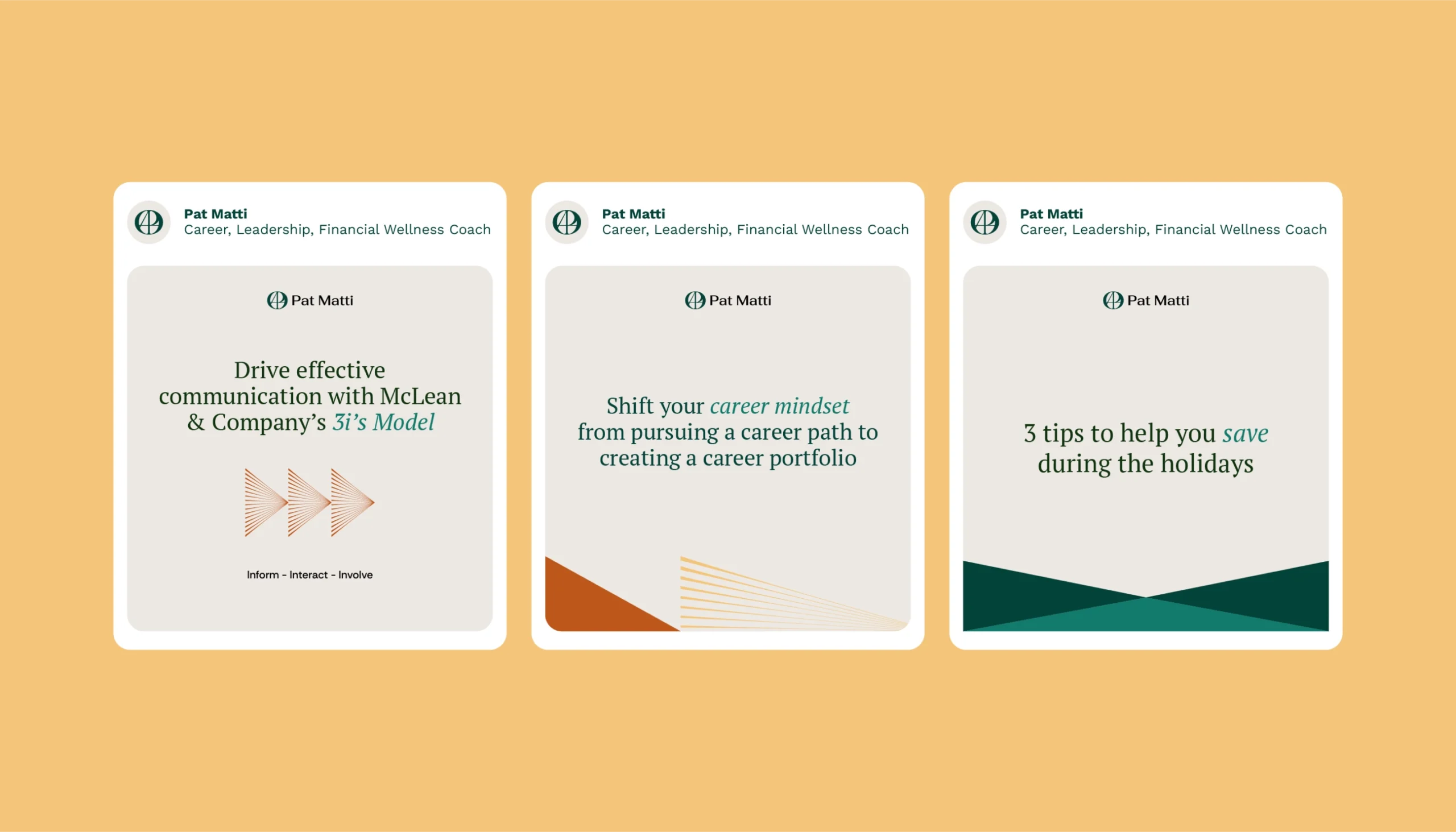

Key Visuals
From stuck to clarity
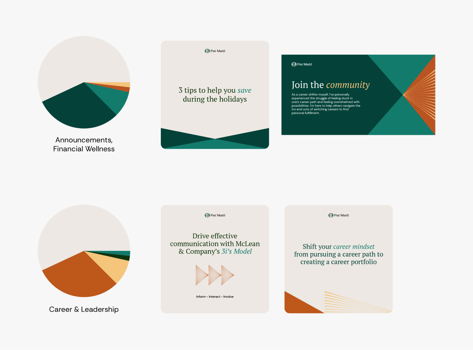
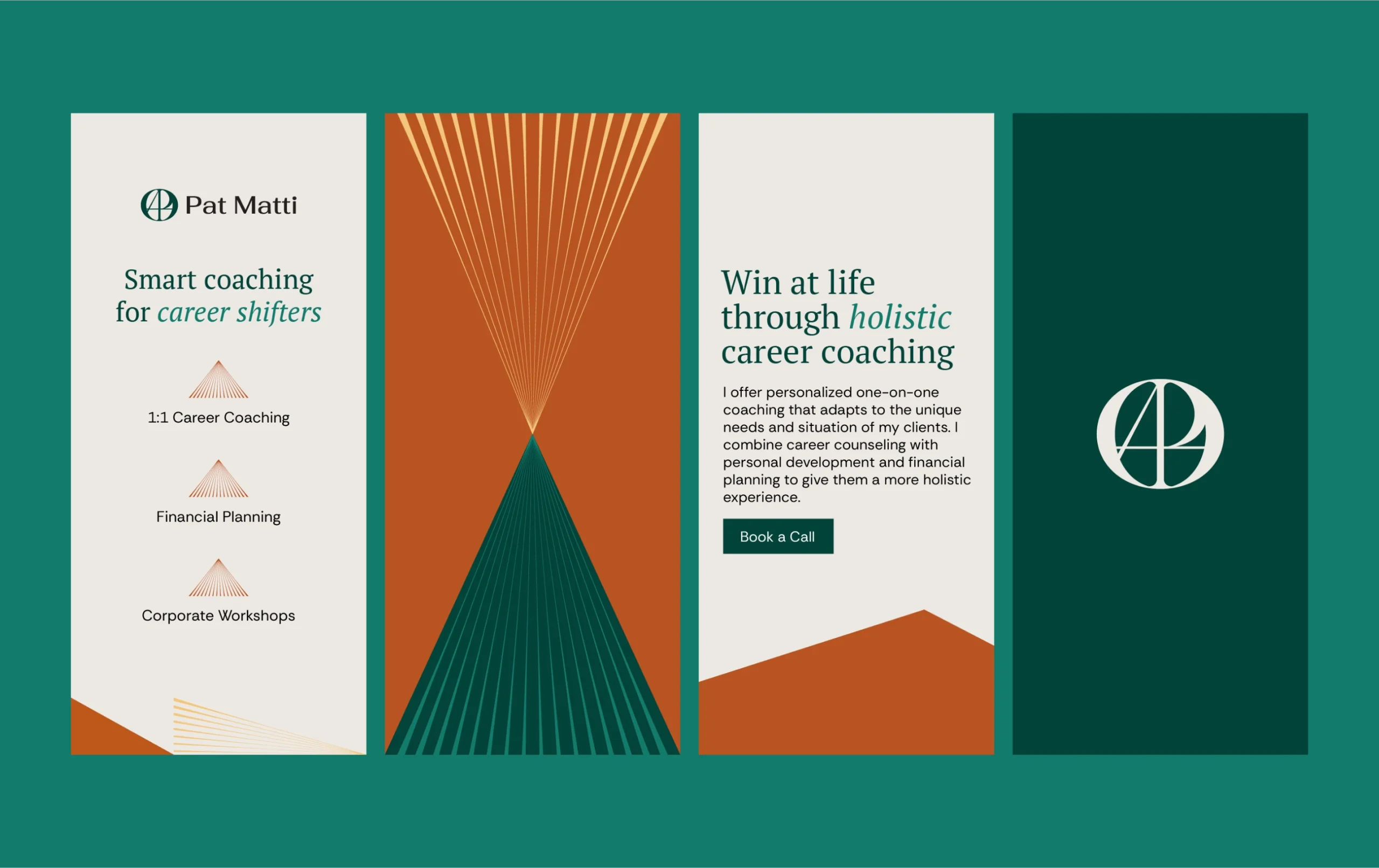
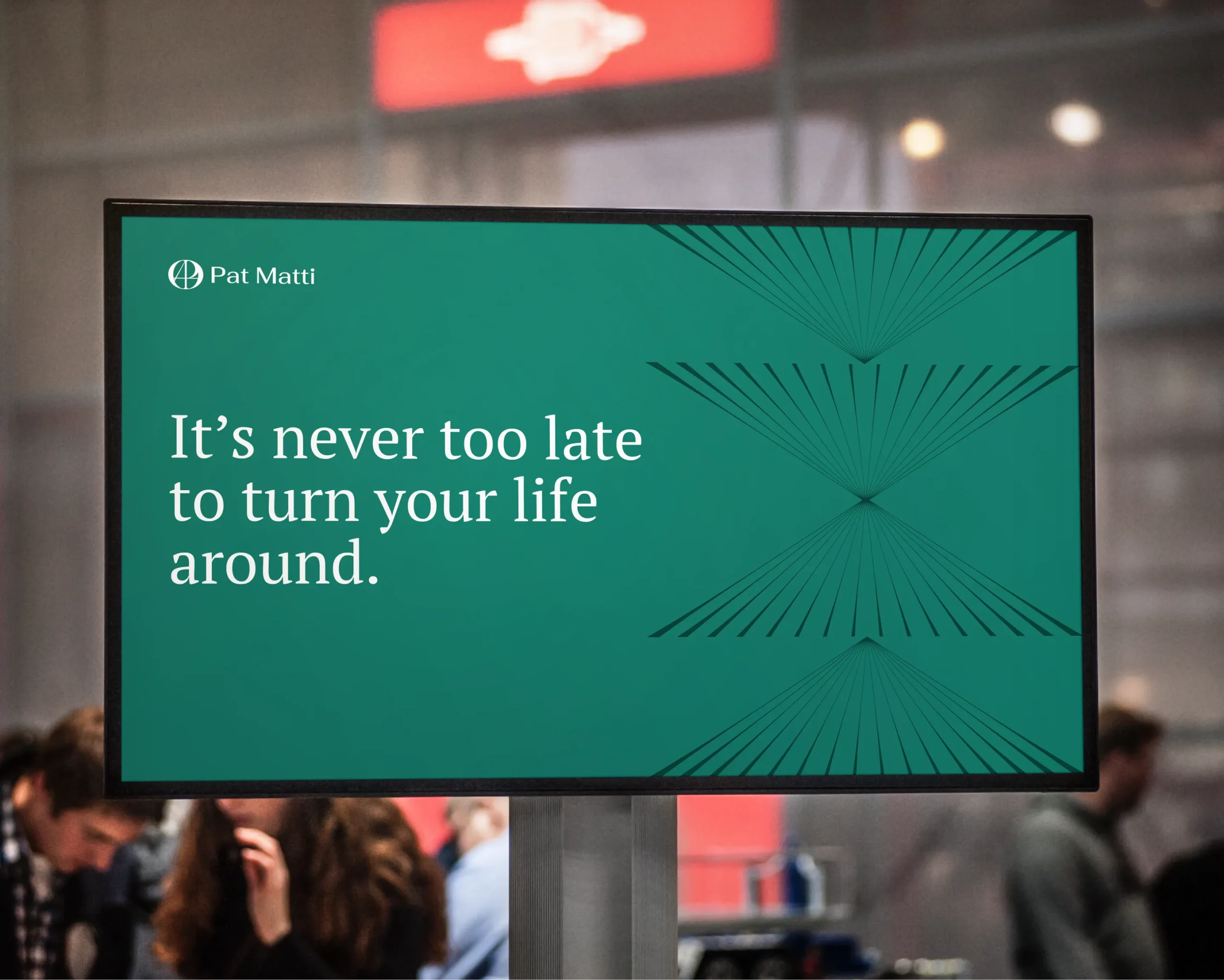
We created a set of elements for Pat to use on all of her brand touchpoints —from social media posts to PowerPoint presentations.
Her Key Visuals are composed of triangles and rays, shapes that are associated to arrows, which can communicate progress and change.
For consistency sake, we created guidelines on the proper color usage for her brand colors.
This came with creative samples and color ratios.
