What We Did:
- Logo Design
- Colors and Fonts
- Key Visuals and Patterns
- Style Guide
The Challenge:
In its pursuit of excellence, Daohaus 1870 saw the need to revamp its visual identity. The studio envisions a fresh and professional image that resonates with its commitment to delivering top-notch architectural designs. This strategic decision comes as Daohaus 1870 gears up for a new phase in its business trajectory, placing a heightened emphasis on marketing efforts to reach a broader audience.
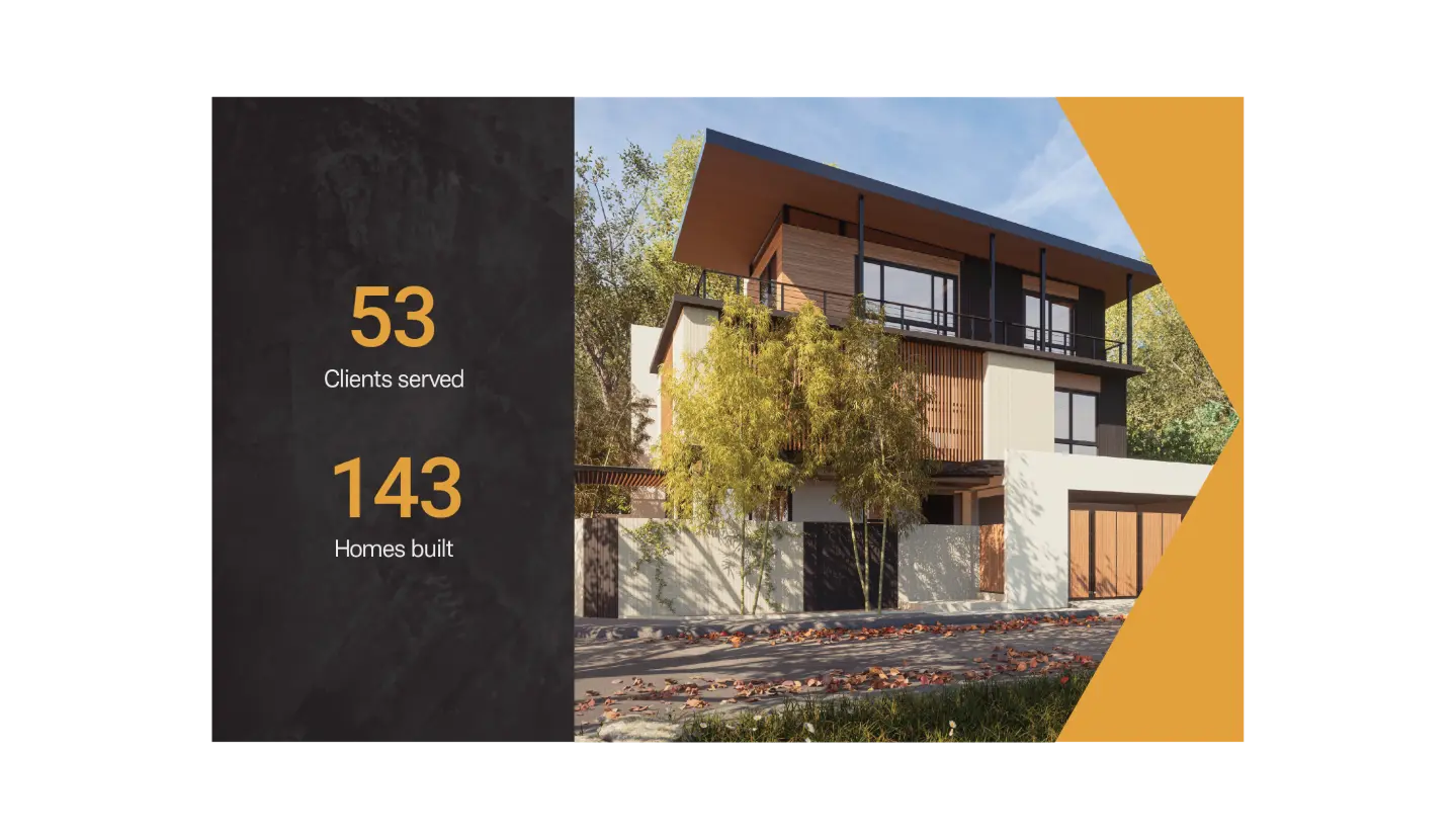
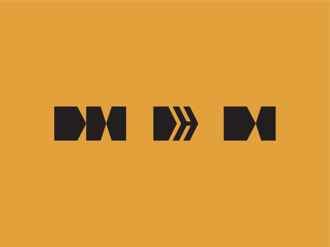
Before any designing, we began the revamp by setting the creative direction through a concept board. Keywords that described the direction are: Informative Educator Transparent Trustworthy Efficient Premium Functional Professional.
When presenting the visual identity, we proposed 3 options and further exploring 1.
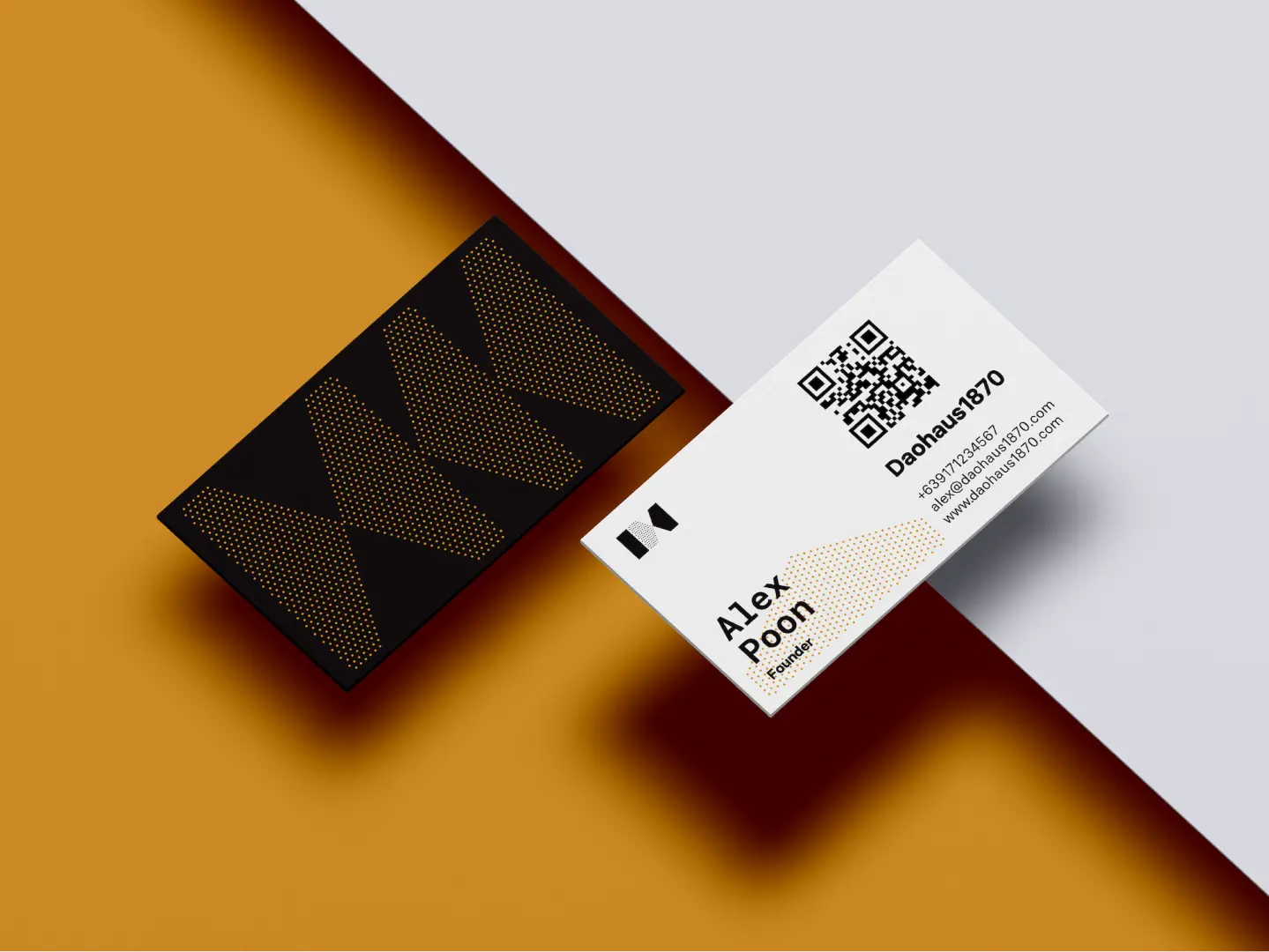
The logo was formed using abstract shapes that appear like buildings/houses, heavily referencing the brand’s focus on architecture. These shapes were then used to subtly create the initials of the brand (D and H)
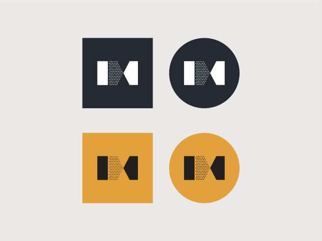

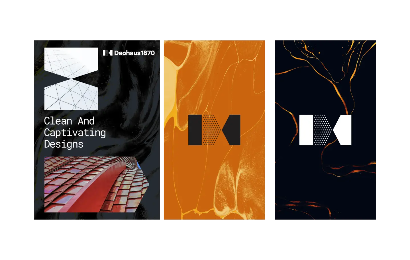
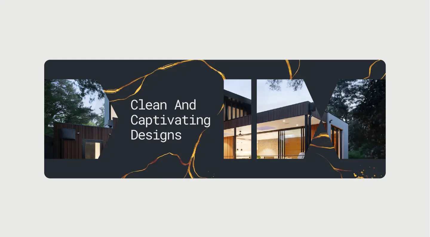
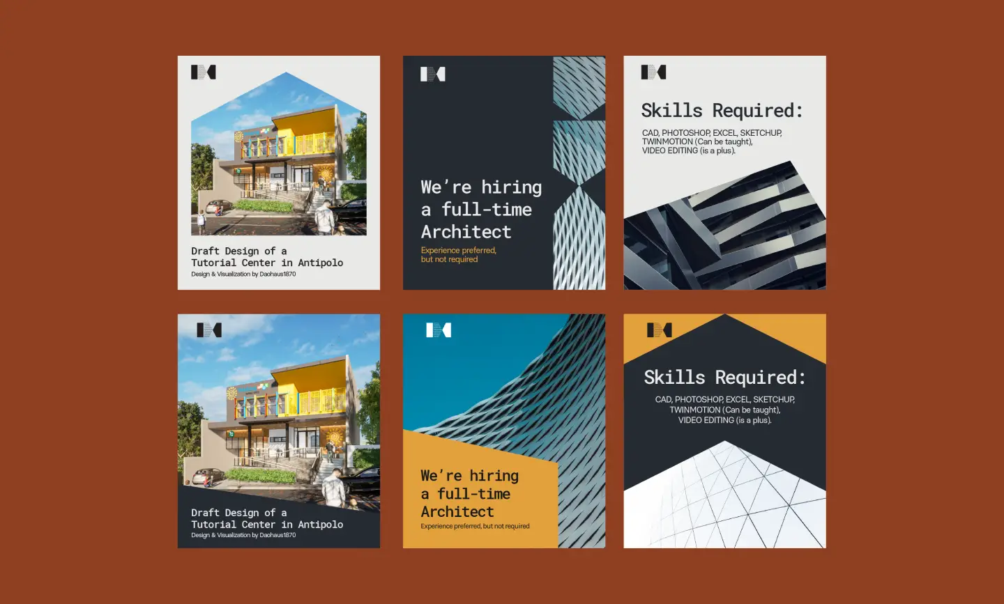
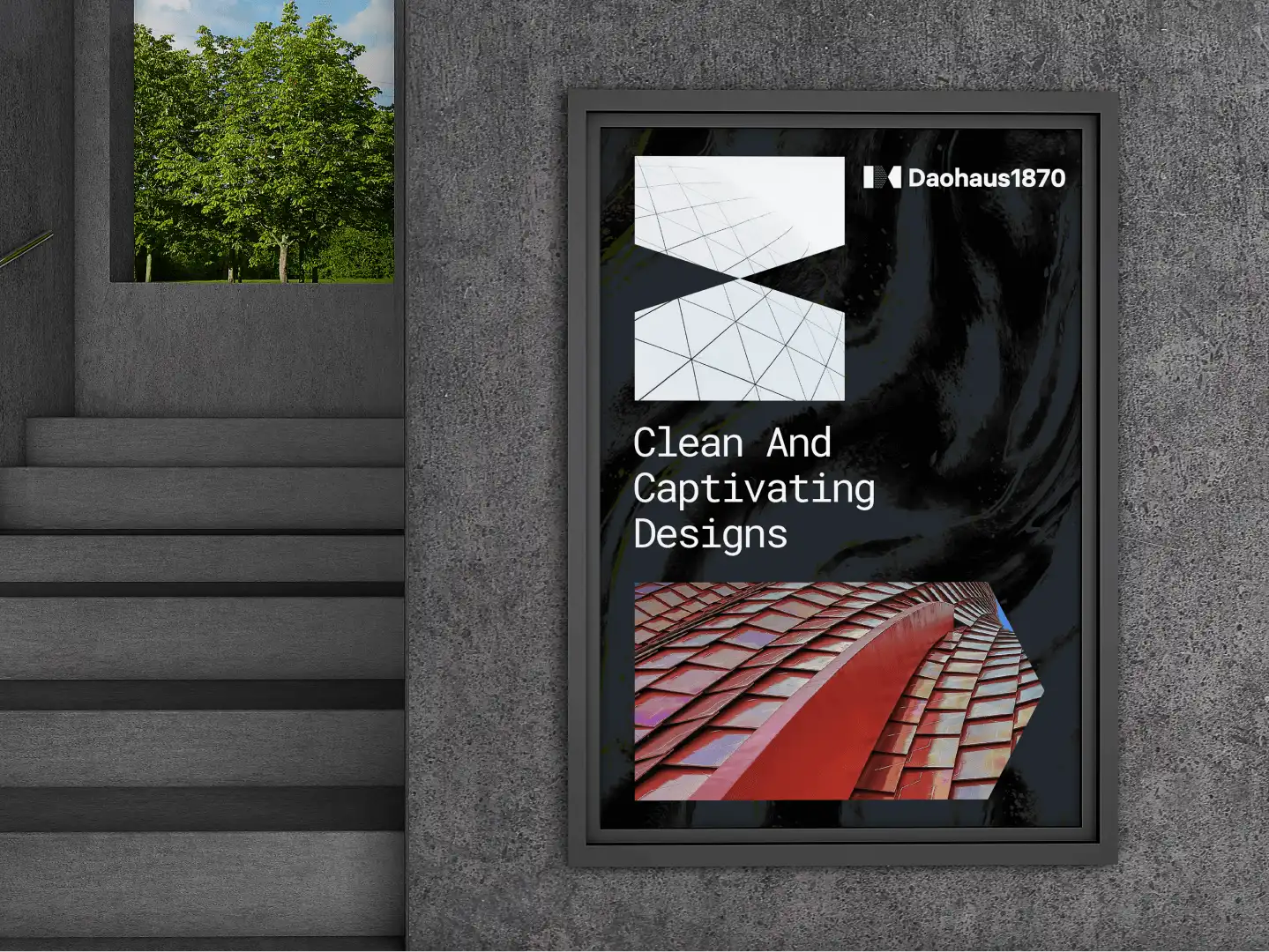
Drawing inspiration from the logo icon, several standard shapes and patterns can be used in graphic compositions in a variety of ways. These can be used as a graphic design element, a frame, or a way to add texture.
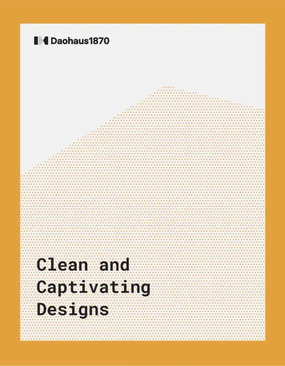
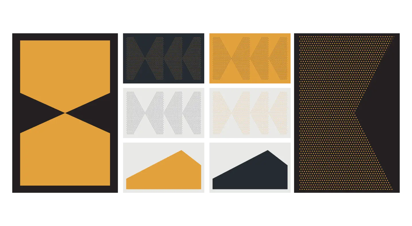
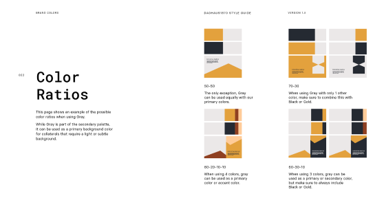
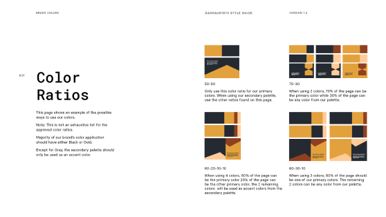
The proposed palette hinges on the idea of quality and trust as Gold can also be associated with these two ideas.
We also gave Dauhaus1870 a collections of textures to use for their marketing collaterals. These textures are based on materials used by the Architectural Studio.
