Blogger’s Gem is a VA agency here to transform the travel blogging scene. They specialize in helping travel bloggers save days of work by handling the technical and tedious job of producing, polishing, and publishing content online.
Their secret sauce is a unique bundle of niche-specific services guaranteed to maximize their client’s reach, make them top-of-mind, and win back time for their loved ones.
Think of them as a one-stop-shop for all your travel blogging needs.
What We Did:
- Brand Naming
- Brand Strategy
- Visual Identity Design
- Brand Manual
The Challenge:
Jem Solis, the founder of Blogger’s Gem, wanted to transition from being a solo freelancer to an agency owner, so the first step was to build her agency’s branding. 2 years into the business, she wants to build a brand that looks legit and professional to her clients. She tried to do it on her own, but she didn’t know what next steps to take.
Brand Workshop
Discovering her unique positioning
Jem wasn’t sure how she could position her services. In fact, she didn’t know how she’d categorize her services. She offered different types of services that require specialization from multiple people (e.g. Pinterest management, blog management, etc.).
We started the project by facilitating 2 90-minute brand workshops to help her uncover her agency’s identity, the biggest impact she can make on her clients, and the position she can carve in her market.
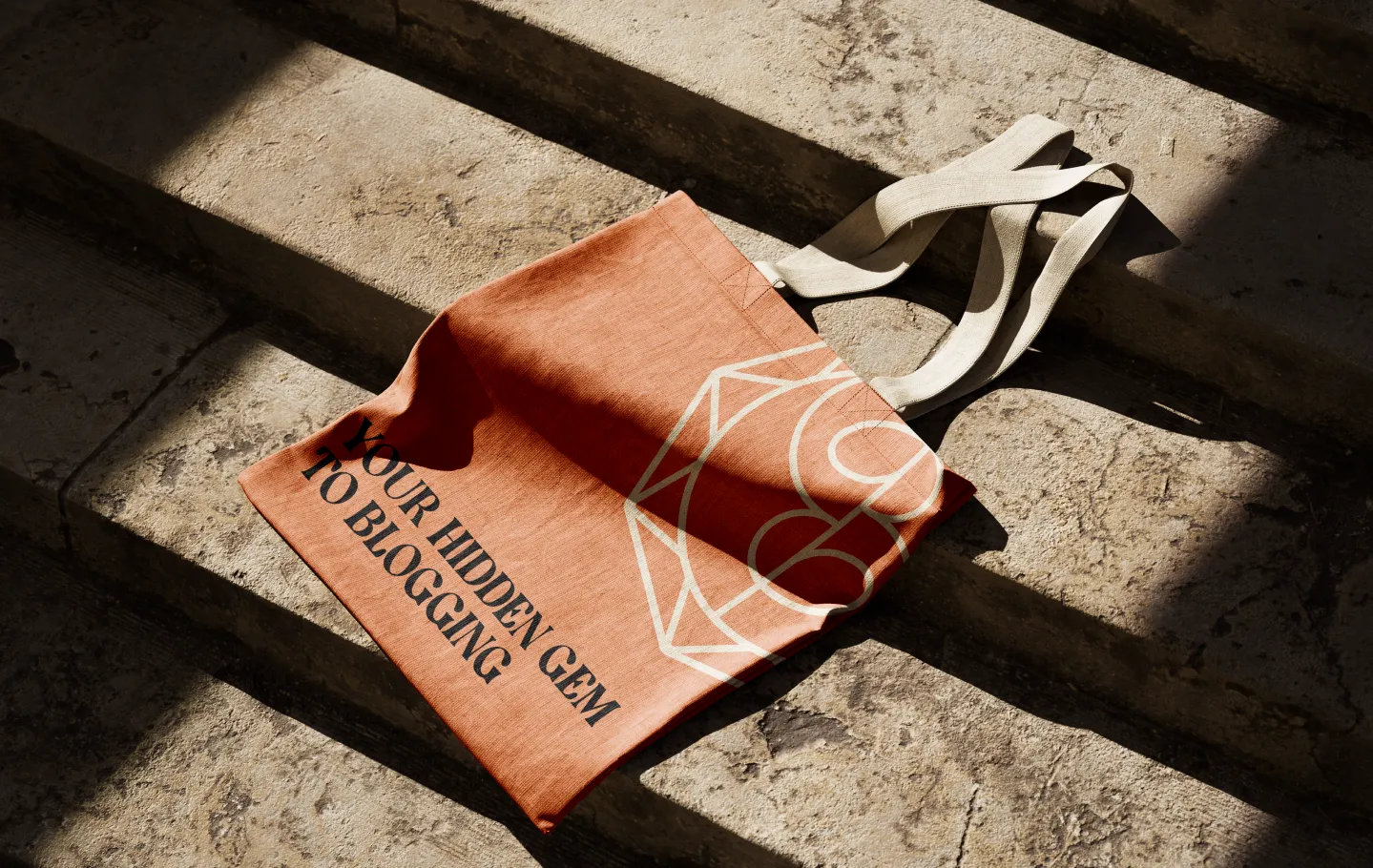
Brand Strategy
Blogger’s Gem: Your Hidden Gem to Blogging Success
Through our workshop and research, we uncovered a few hidden gems that inspired the brand’s name, tagline, and overall messaging.
Jem’s all-around VA services are a game-changer for her clients, allowing them to save 2-3 working days each week. For travel bloggers, this means more time to dive into their adventures. Given Jem’s versatile approach to supporting content creation, we aimed to position her as a one-stop shop VA agency. Jem also wanted to explore incorporating her name into the brand’s messaging, and we successfully integrated the word Gem into her brand’s language.
What we did:
- Brand Naming
- Vision & Mission
- Purpose
- Values
- Personality & Voice
- Ideal Audience
- Reason(s) to believe
- Tagline
- Message House
- Positioning

Visual Identity
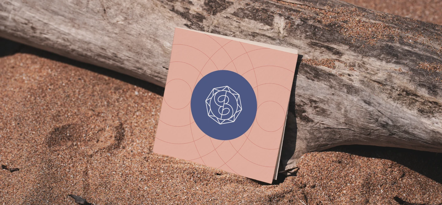
The visual identity was designed to evoke the warmth of summer and the excitement of travel. We created an abstract logo mark that cleverly incorporates the sun, the letters B & G, and a gemstone, blending these elements into a cohesive symbol.
What we did:
- Logo Design
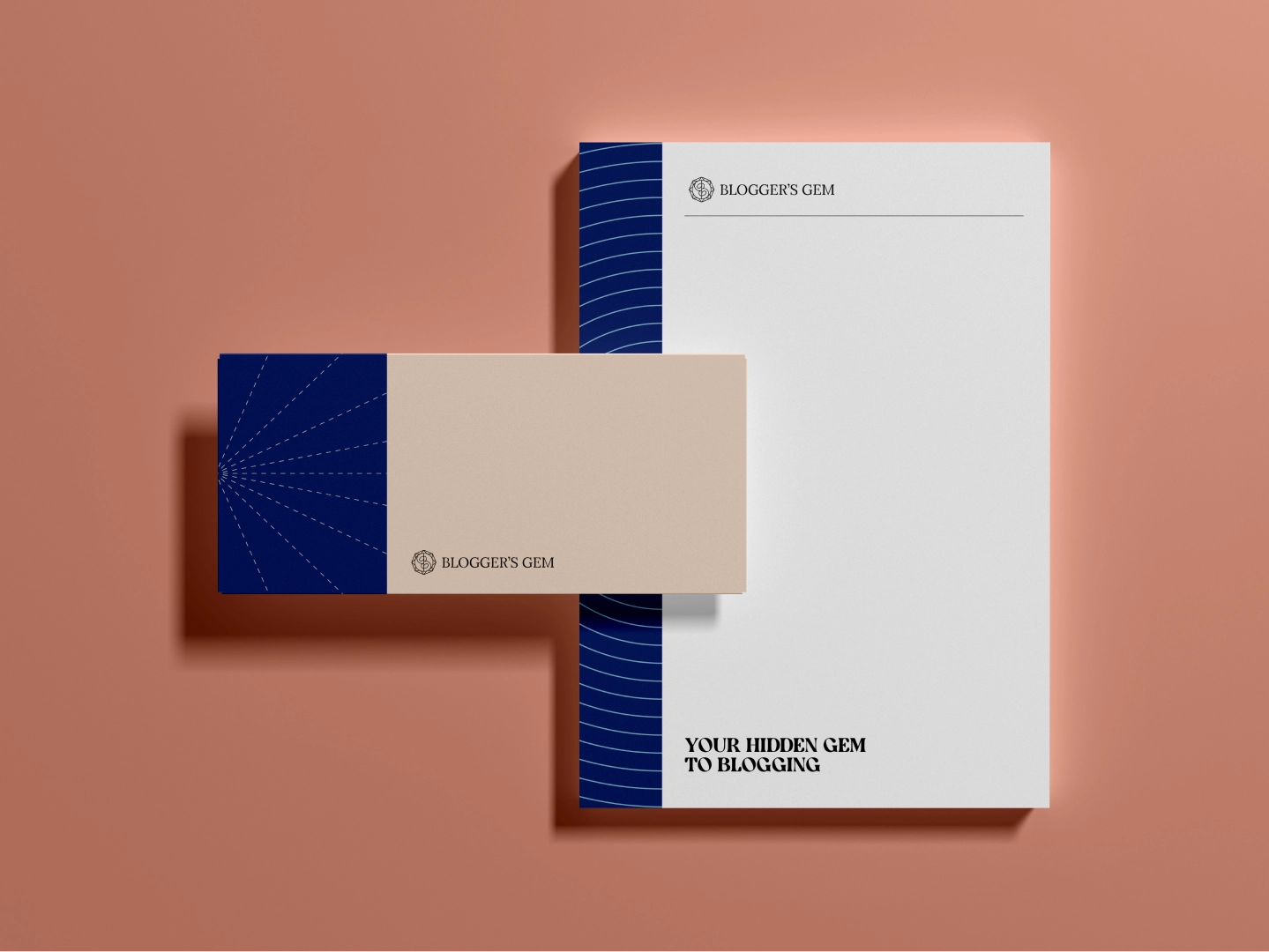
- Colors & Fonts
- Key Visual Elements
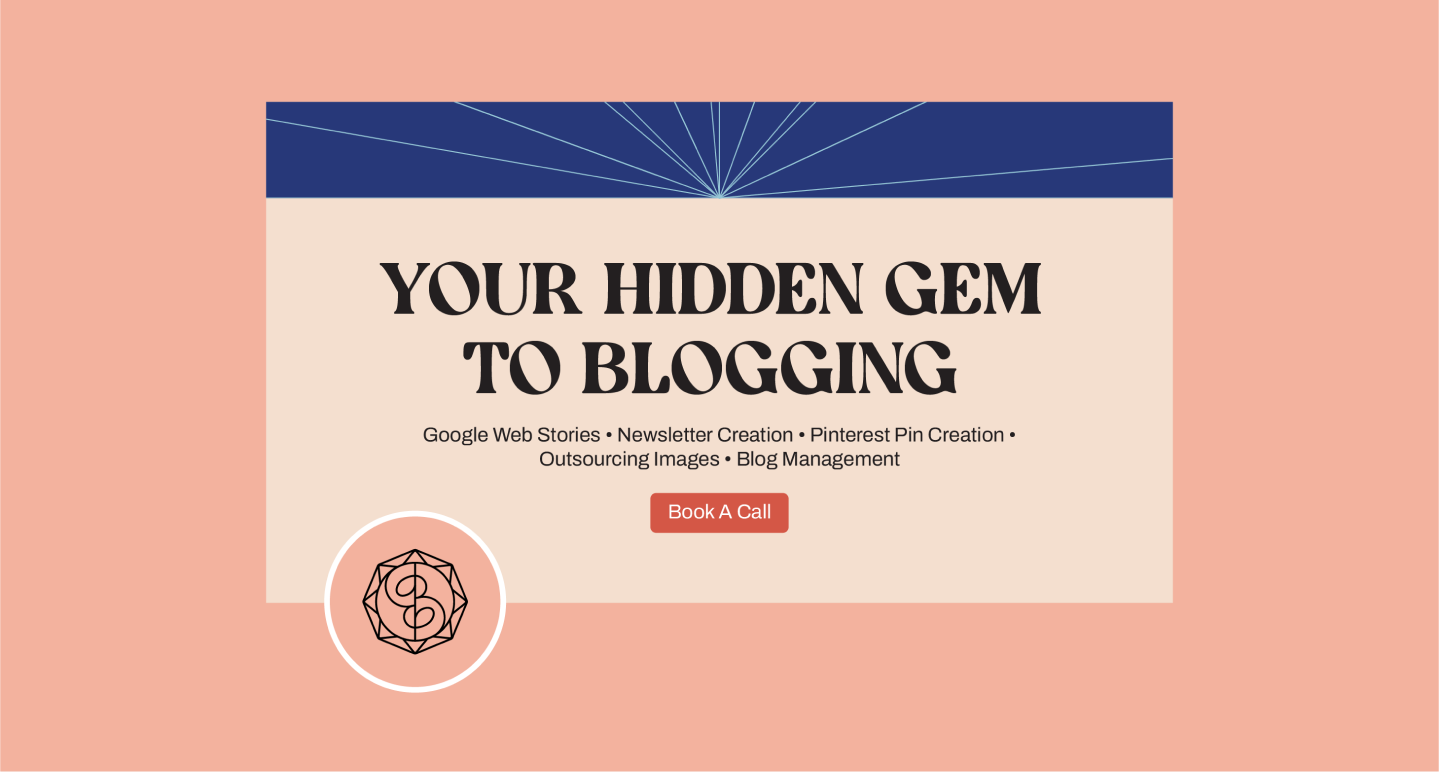
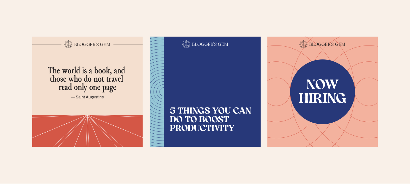
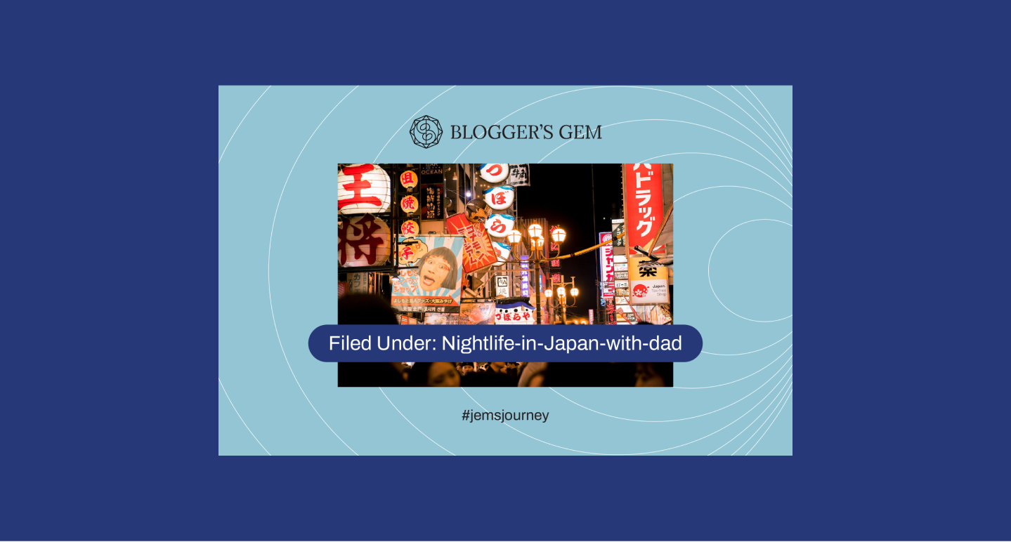
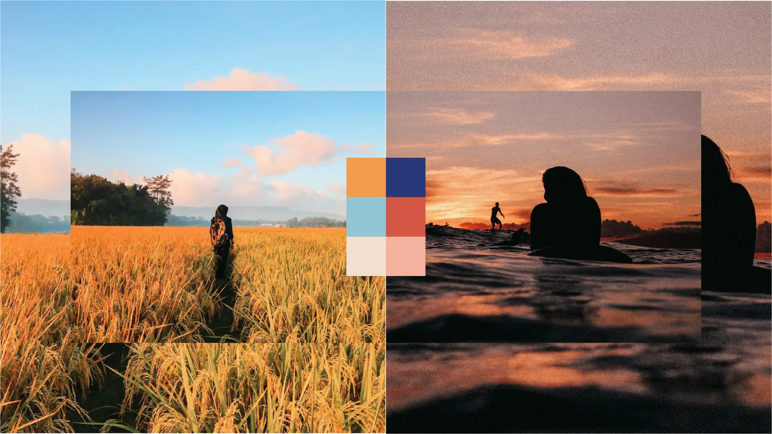
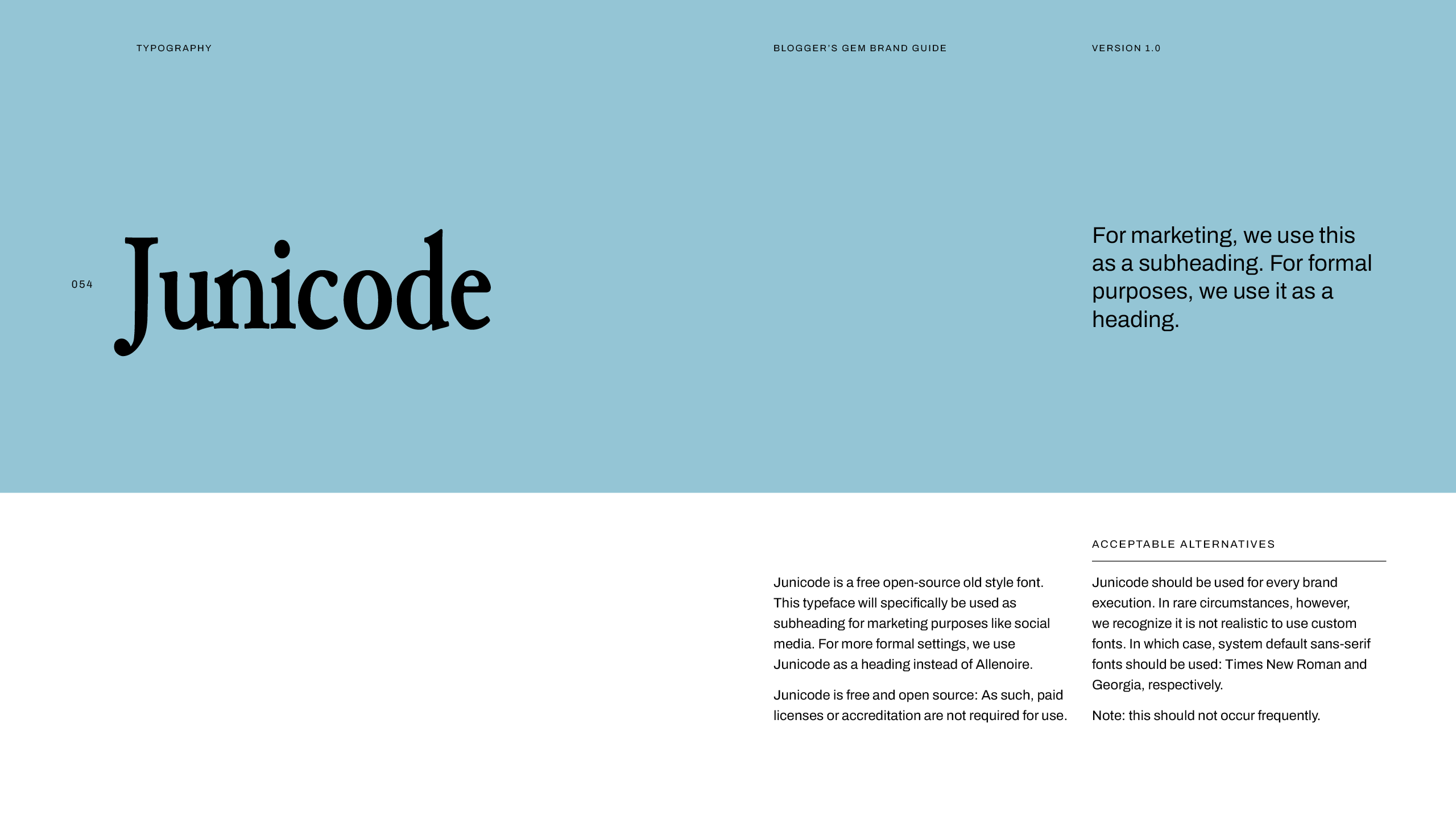
To further communicate the brand’s personality and reinforce the associations with traveling, we carefully selected a type combination and color palette that captures the vibrant energy and nostalgic feel of travel.
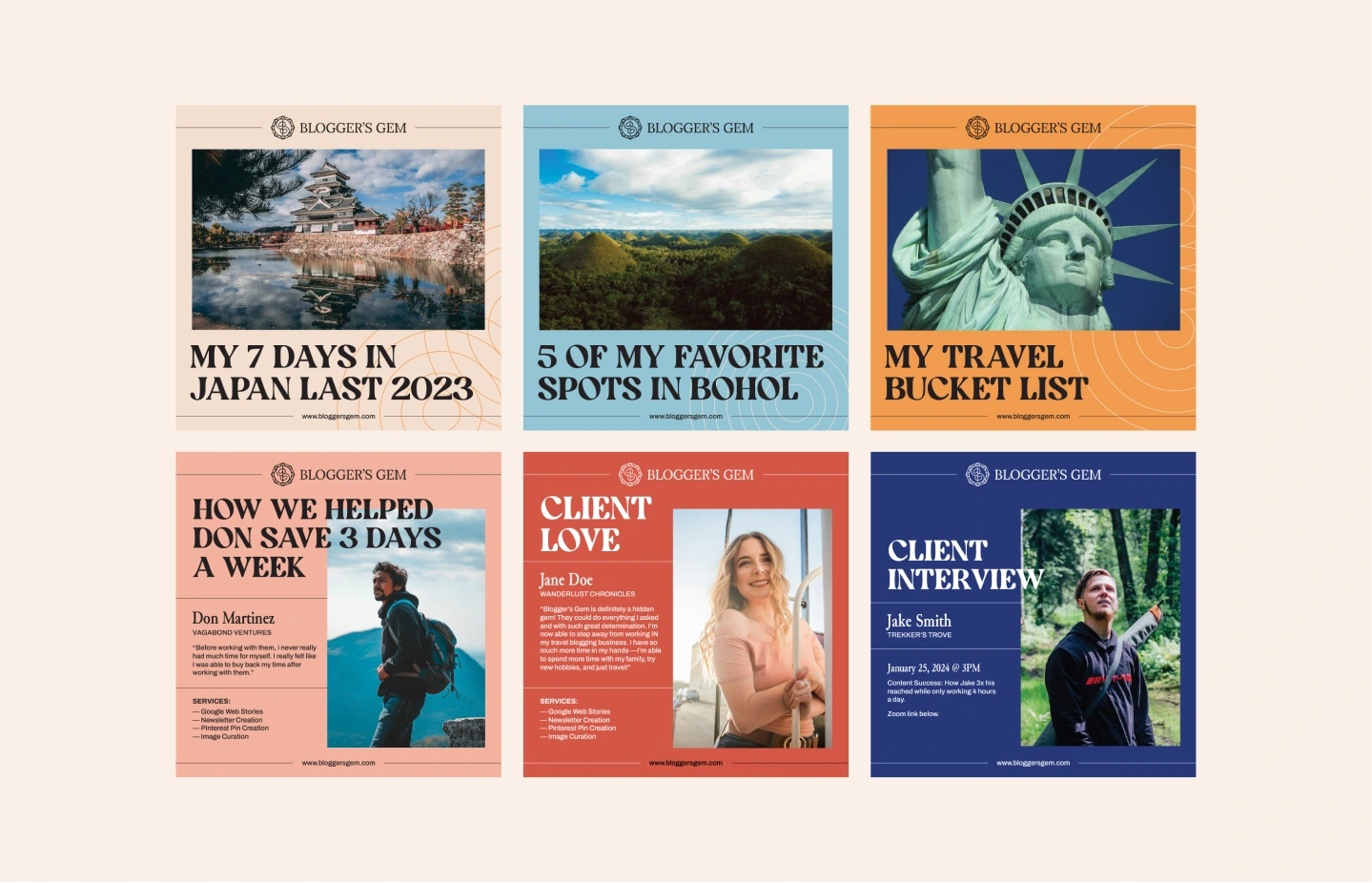

We created custom illustrations and patterns that are designed to add visual interest and playfulness to the page
It features thin and elegant lines and is ideally presented in monochromatic colors that complement the background. The elements are reminiscent of sun rays, tying back to the spirit of travel and reinforcing the brand’s iconic imagery.
