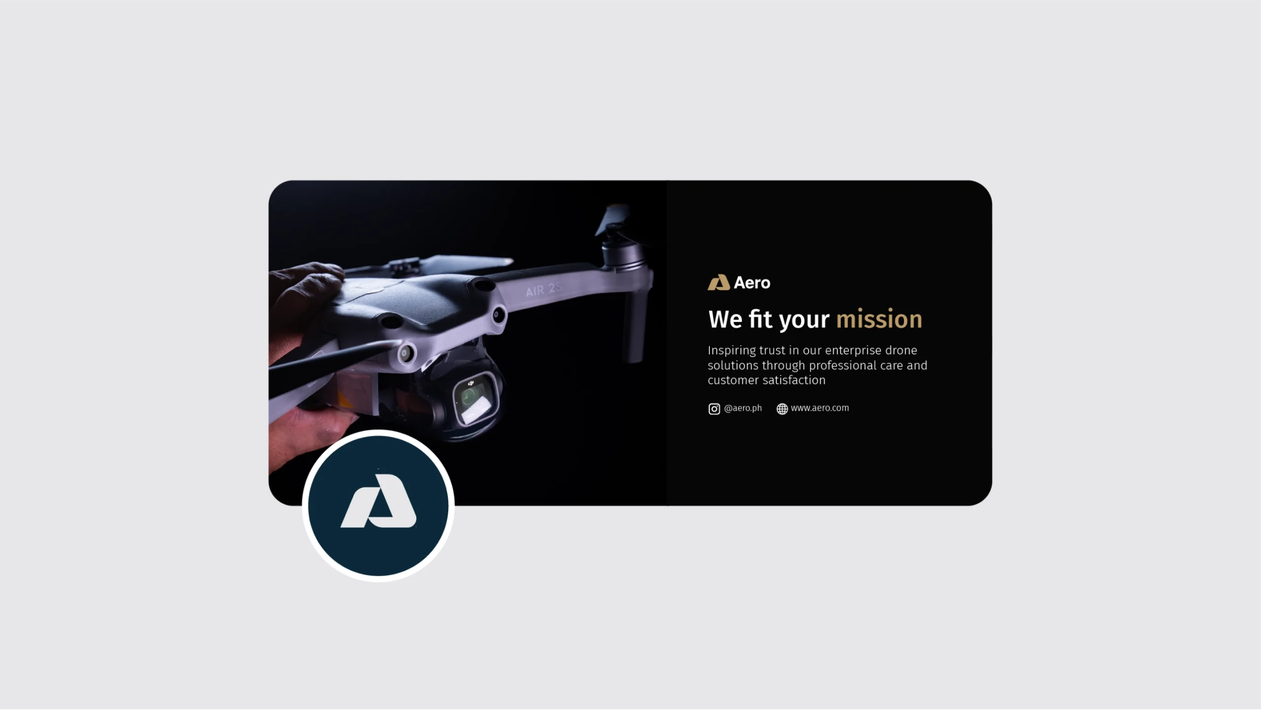
Aero is an enterprise drone solutions provider based in the Philippines. Good customer relations is at the heart of their business. They help their clients find the right enterprise drone solutions tailored to their needs, providing reliable technical support at every step of the way.
The Challenge
Given that they were catering to enterprises, Aero faced the challenge of not just selling a product but establishing trust in their solutions. The drone industry is competitive, and customers often seek not only cutting-edge technology but also reliable customer support and service. As they prepared for their launch, they needed to make sure that their branding reflected credibility and their difference
What We Did:
- The Big Idea
- Brand Difference
- Tagline
- Manifesto
- Personality
- Tone and Voice
- Copywriting Guide
- Visual Identity
- Brand Guide

Messaging
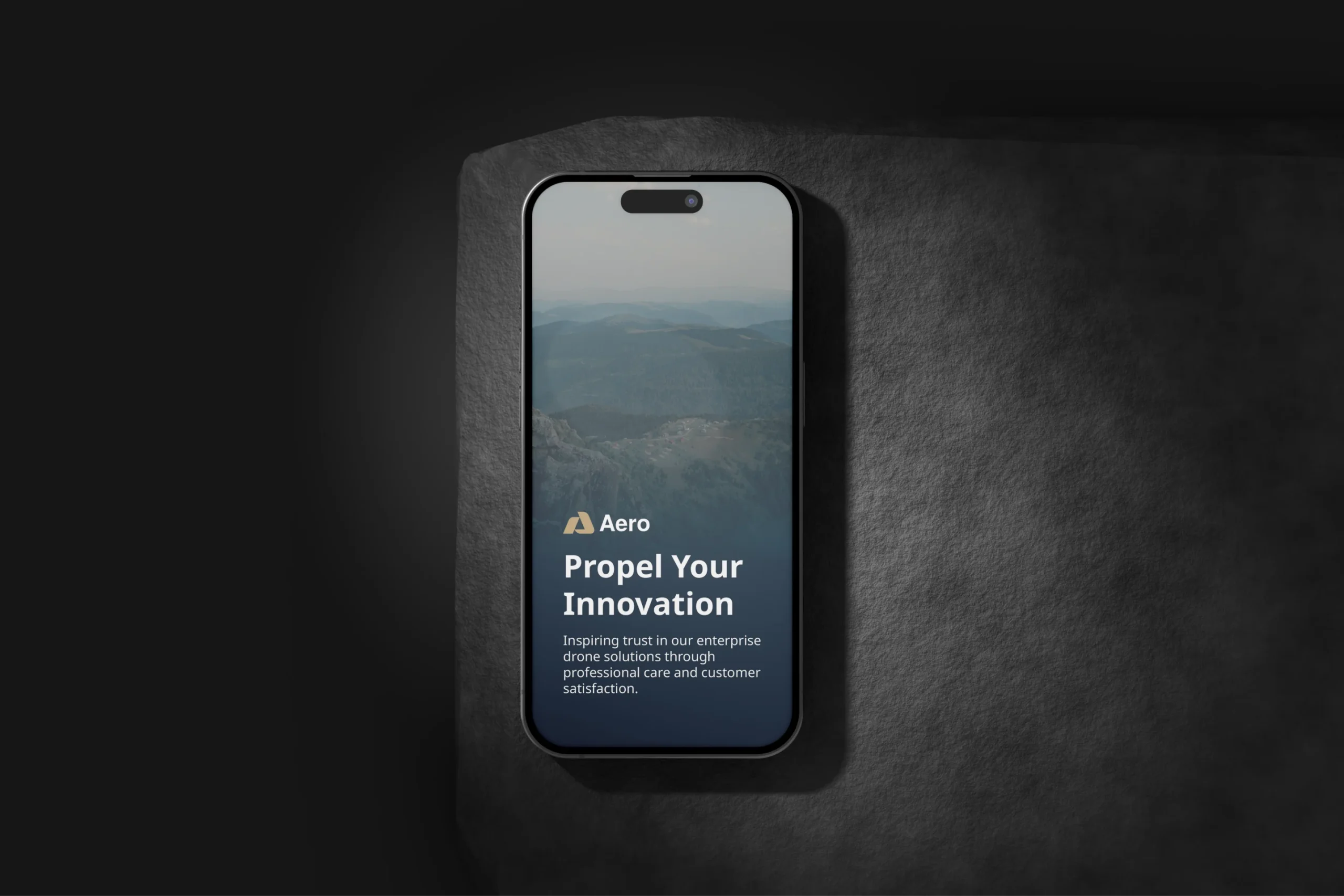
Propel Your Innovation
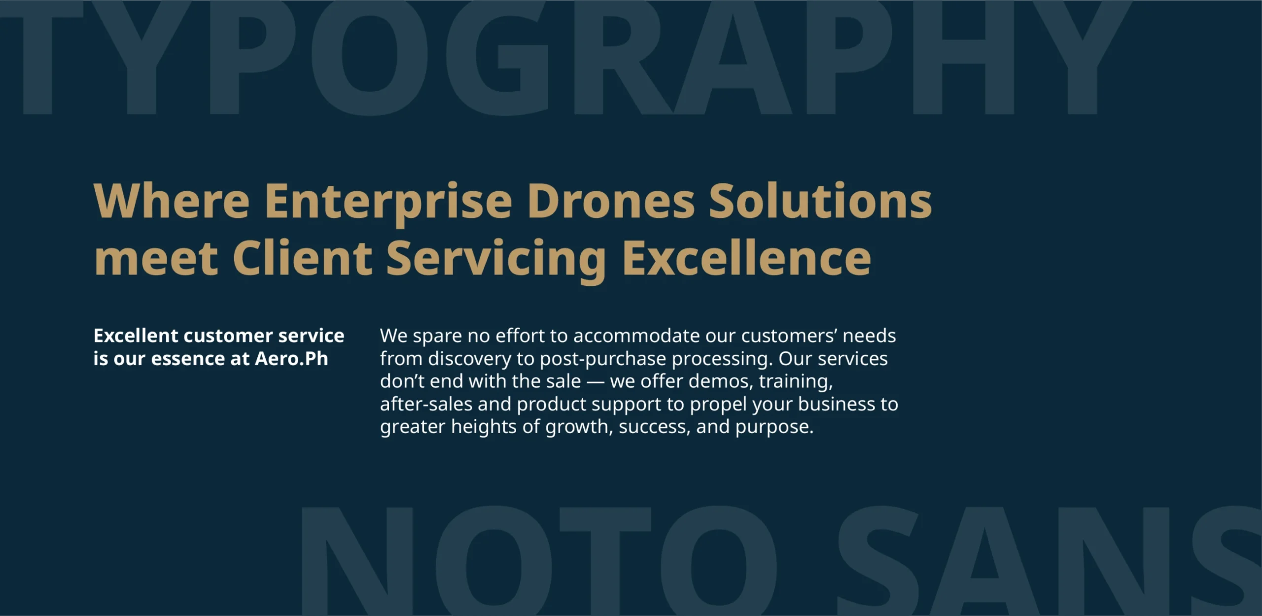
When creating their messaging strategy, we highlighted their difference: “Where Enterprise Drone Solutions meet Client Servicing Excellence.” Not only does this communicate their difference, but also caters to their audience’s needs for extra client support
What we covered:
- Tagline
- Personality
- Voice and Style
- Tone of Voice
- The Big Idea


Visual Identity
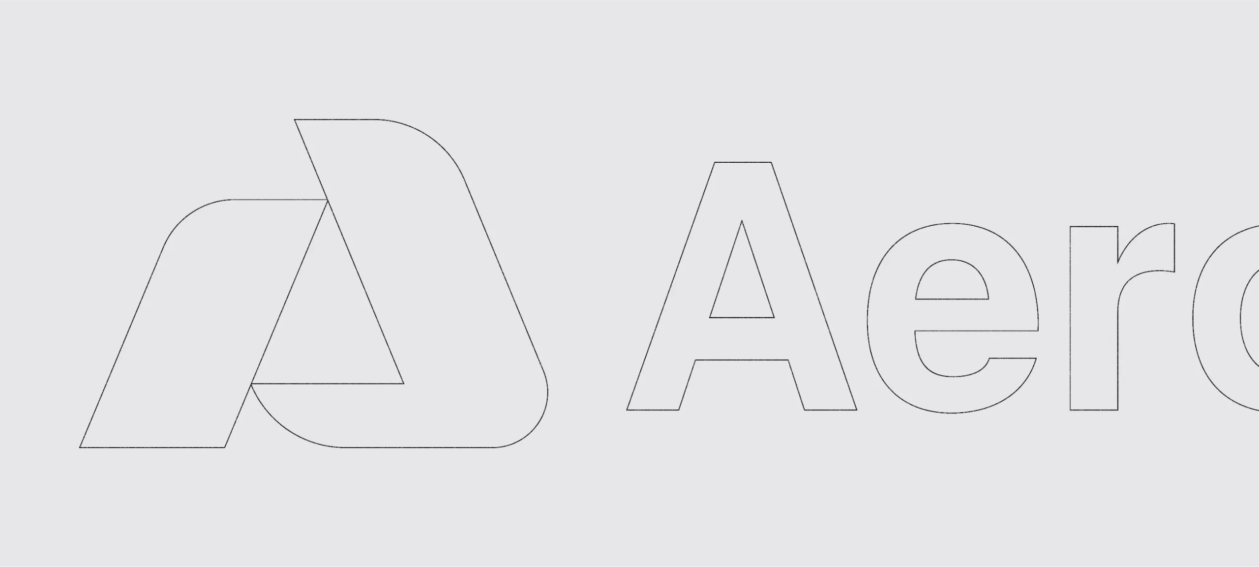
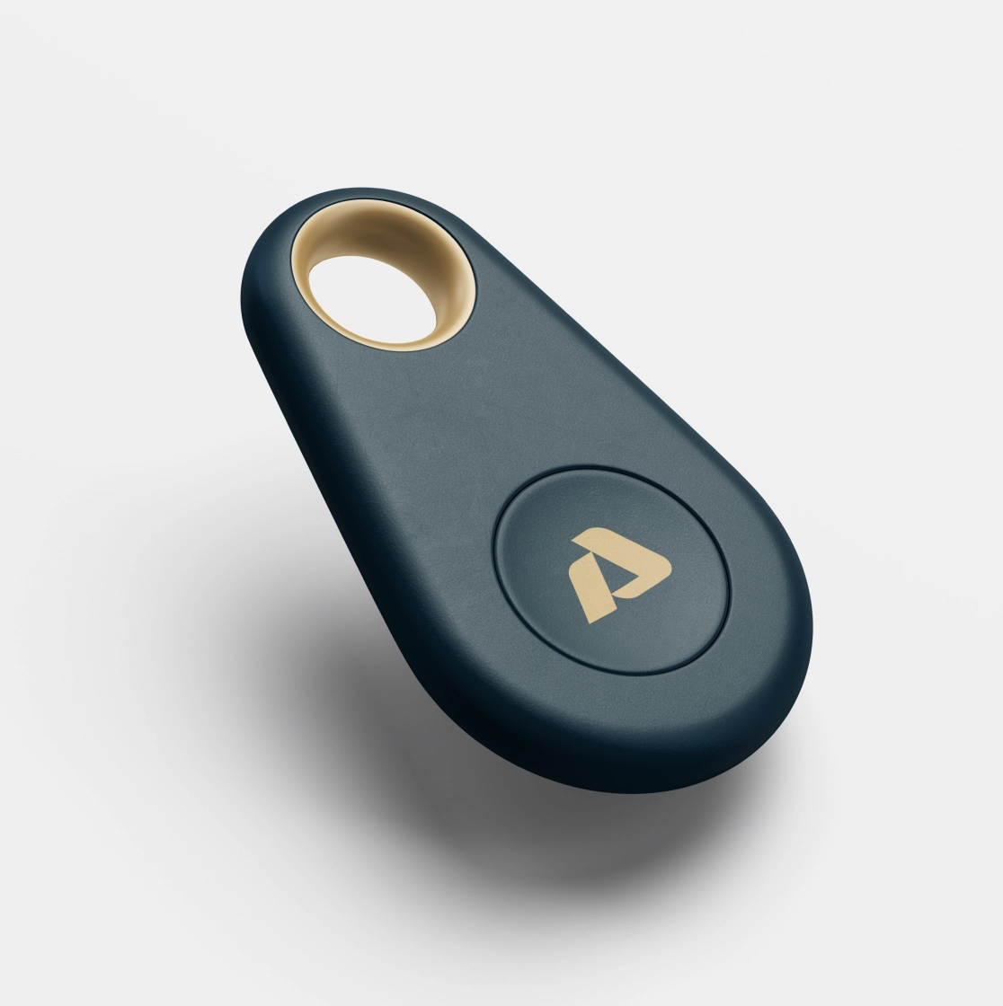
From their logo to their typography, we focused on a more minimalistic and clean look. The symbol is a simple icon made out of the letter A; however, in the icon are subtle elements of excellence (arrow formed by the negative space), and aerial solutions (letter A was formed by shapes resembling propellers).
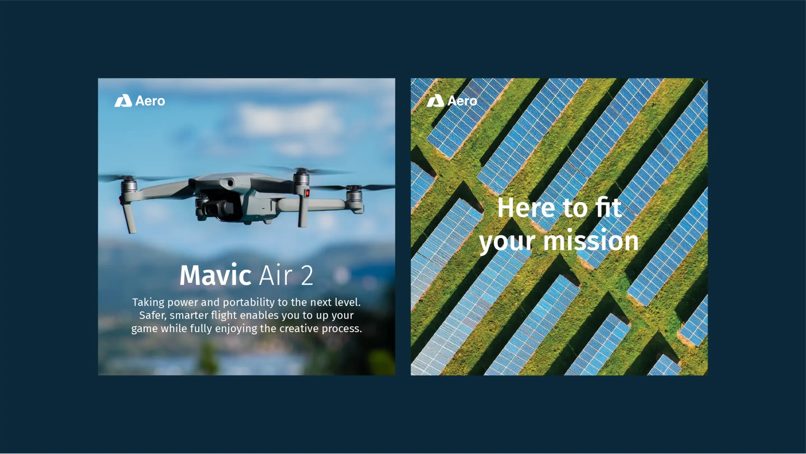
For a professional and clean look, we went with a gold, blue and white combination, and a one font look.
What we covered:
- Logo
- Typography
- Colors
- Style Guide
