Travelisimo, a brand dedicated to making travel enjoyable and stress-free, emerged as an experimental Amazon venture testing the demand for portable electric lunch boxes. Over the years, it has evolved into the top Amazon seller in Europe, offering comfort to digital nomads, adventurers, and road warriors.
What We Did:
- Brand Strategy
- Brand Messaging
- Key Visuals
- Colors and Fonts
- Packaging Design
- Brand Manual
The Challenge:
Travelisimo faces a significant challenge in expanding its brand beyond portable electric lunch boxes. Seeking to broaden its product line and dominate the U.S. market, Travelisimo’s founder acknowledges a lack of clarity in the brand’s vision and identity. The company envisions becoming a comprehensive travel brand, but faces the challenge of defining its identity for successful expansion beyond its initial product success.

Brand Strategy
Our approach to delivering the brand strategy for Travelisimo began by addressing the founder’s uncertainty regarding the brand’s vision and future products. Our first step was to articulate the brand’s core idea, which we defined as: Travel to your heart’s content – Experience life’s moments of awesome whenever, wherever, with innovative travel gear to spice up life on the go. With Travelisimo, you can embrace the nomad lifestyle and soak in the great outdoors without a care in the world.
This clarified brand idea serves as the foundation for our comprehensive strategy, ensuring that all subsequent decisions align with Travelisimo’s core values and resonate with its diverse audience.
What we covered:
-
- Big Idea
- Vision & Mission
- Purpose
- Promise
- Values
- Personality & Voice
- Ideal Audience
- Brand Messaging
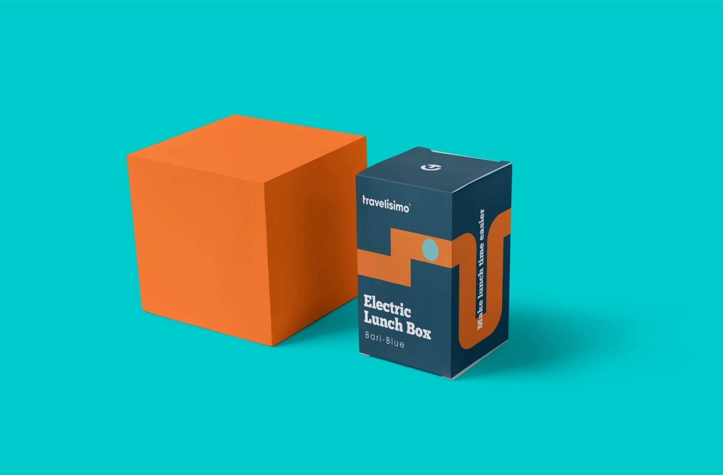

Visual Identity
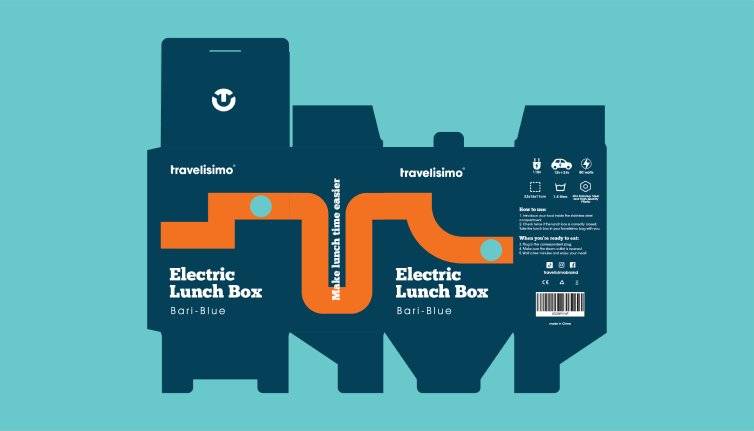
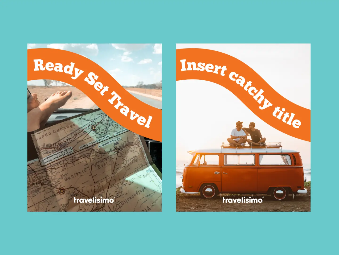
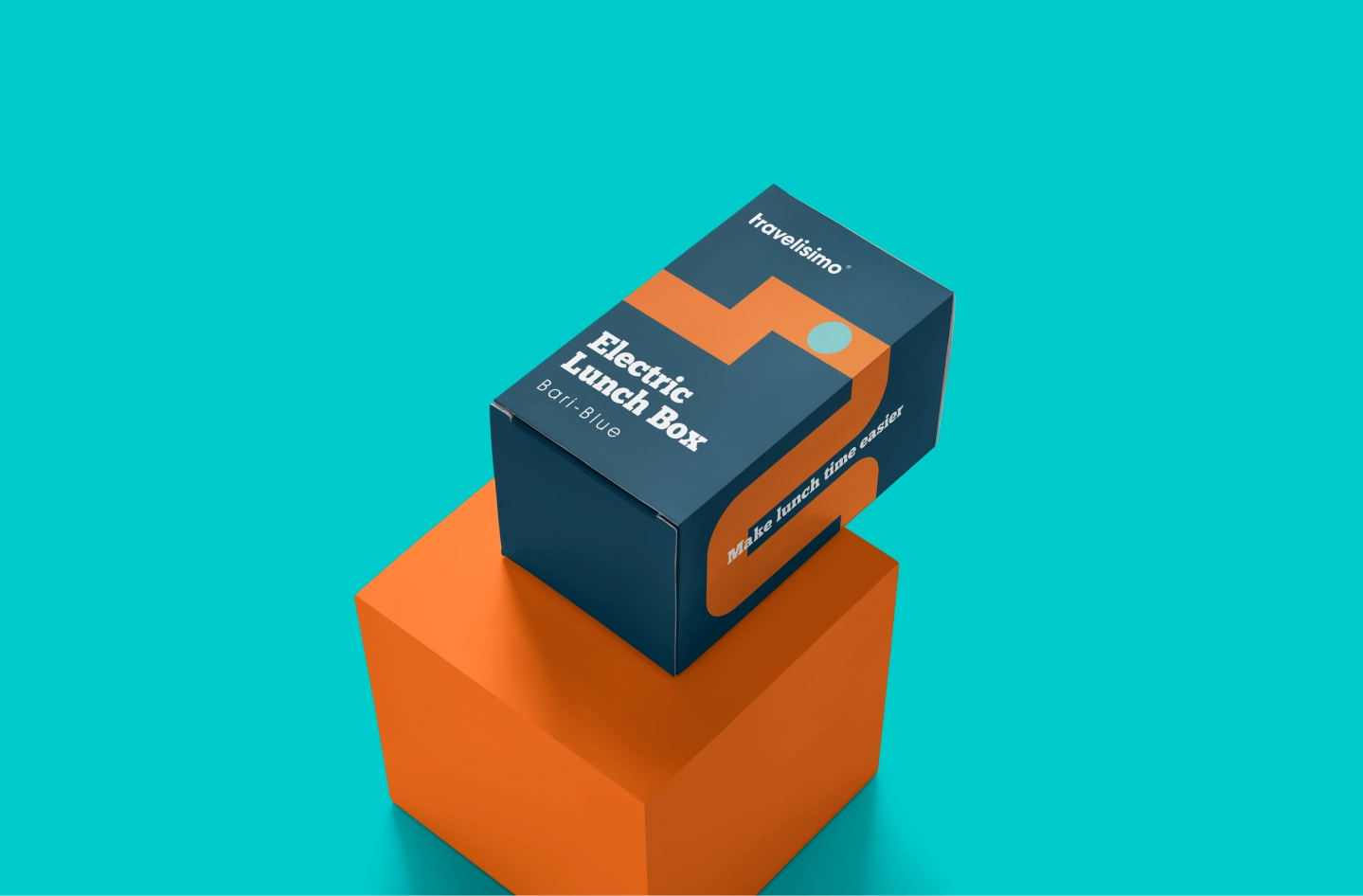
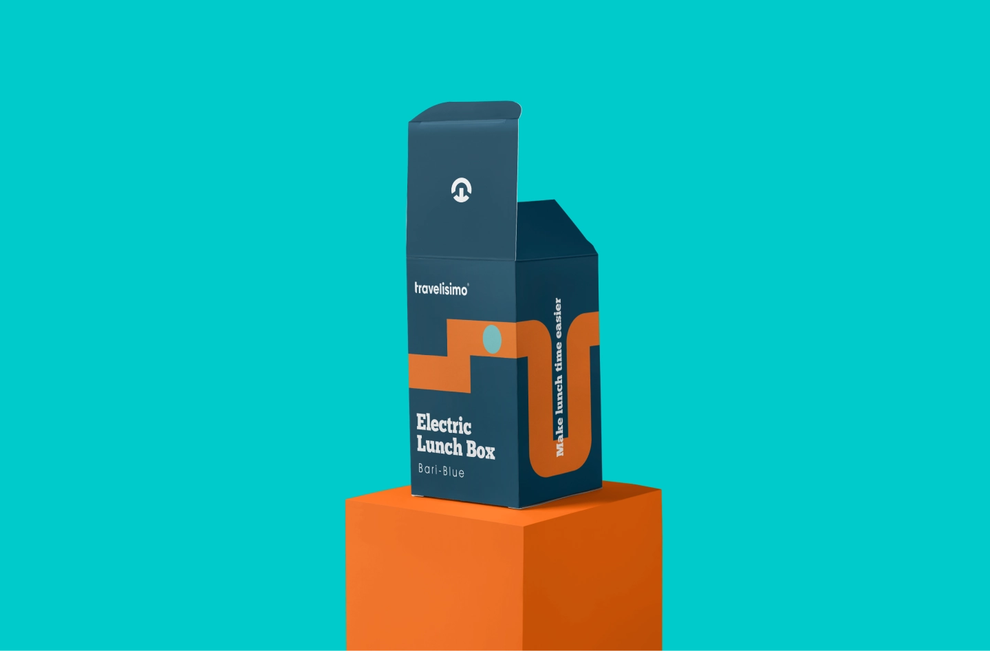
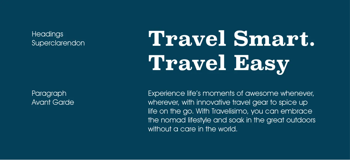
Based on the brand’s big idea, we updated their colors & fonts, and created key visuals that helped communicate the outdoorsy and travel aspect of the brand. We then applied all these elements onto the packaging.
What else we did:
-
- Key Visuals
- Colors and Fonts
- Packaging Design
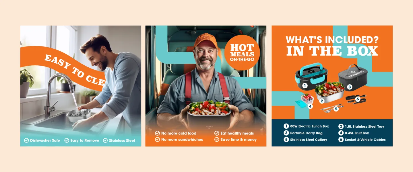
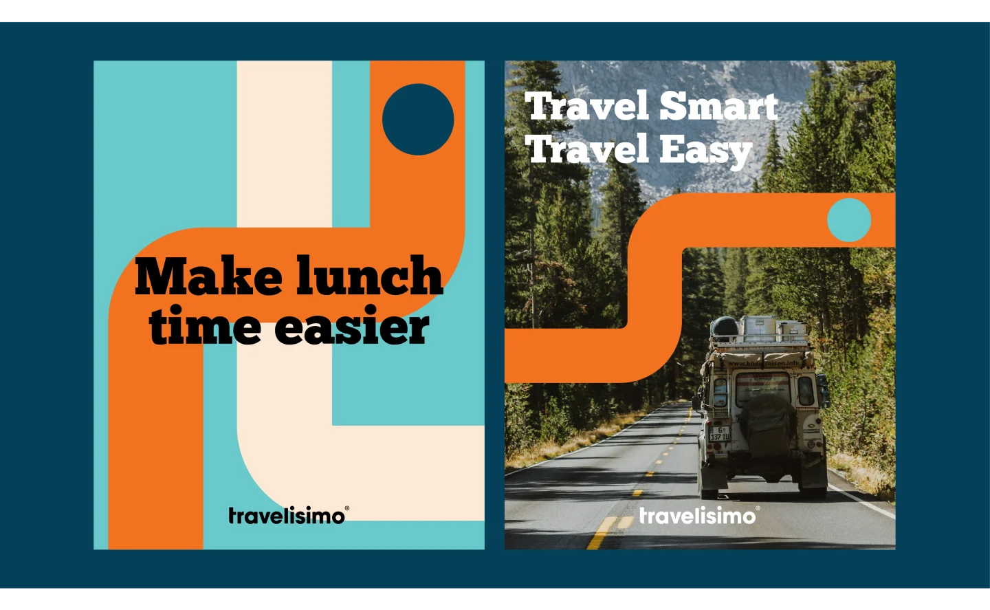
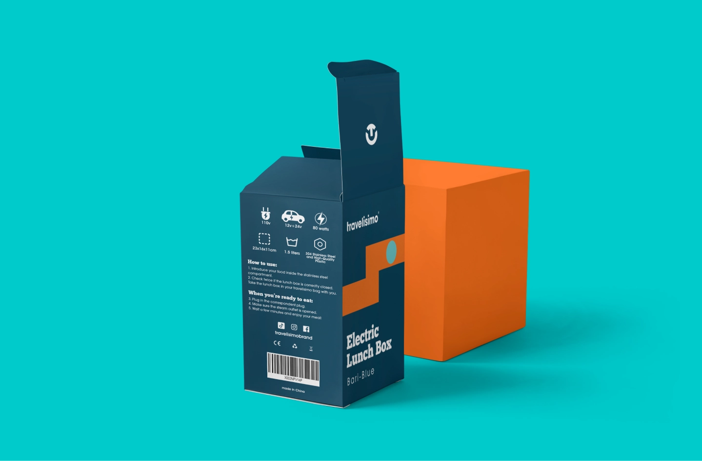
The Key Visuals were inspired by the idea of a map —fitting for a brand that revolved offered portable travel gear for its customers.
The Key Visual can be used as a design element, pattern, or as a way to frame important text or content.

